vrmcs14

Disconnected: A Photo Essay Refections

Disconnected: A Photo Essay explores the relationship between hands, shoes, and our personal identities.


Reflection 1: On the Choice of Camera and Photographs

There were a number of possibilities for the camera that I could use in this project.  Should I use a disposable camera in order to reflect the idea that we treat our hands as disposable objects, ready to be used and then discarded until future use?  Should I manipulate the images with filters and cropping to draw attention to specific moments?

After careful consideration, I chose a digital camera, a Sony Cybershot DSC-W530.  There’s nothing inherently special about this camera: the features are for the ease of amateur photographers, not intending for the user to be overwhelmed by possibilities.  This camera best suited my needs in a couple ways.

First, a digital camera captured the texture and detail of the hands and shoes.  The lines, wrinkles and age spots wouldn’t appear on a disposable camera the same way they would on a digital camera.  The shadows in the mesh or fabric of shoes were brightened and intensified by using the digital camera.

More detail, the kind a more advanced camera captures, would have greatly enhanced the focus I was trying to portray.  However, in weighing my options, I chose instead to capture natural images of people who were comfortable with being photographed.  Even with a simple camera, when I first began taking pictures, I got a series of questions signaling their discomfort, especially those I didn’t know.  What did I want them to do with their hands?  What was the purpose?  How many people were going to see?  These first photos felt staged and awkward because the subjects were so uncomfortable.  They didn’t show the natural dichotomy between hands and shoes that I was looking for.

Using a digital camera also allowed me to “sneak” some pictures.  Digital cameras don’t draw attention to themselves the same way professional cameras do: nearly everyone owns a digital camera in this technological age, even if it’s the one built into their phones.  If I had a digital camera out, looking at the screen, others did not spare a second glance.  To counteract some of the nervousness of the subjects, I could take the photos of their hands first and inform them after, showing them the pictures and asking their permission to use them in the essay.

In this technique I captured a series of photos from various subjects.  I carried a camera with me everywhere I went, always on the lookout for interesting activities.  I photographed many people in order to have a wide variety of tasks to show in the essay.  The more I photographed, the more I became aware of the best light, the best angle.  For example, in one photograph, the subject wanted to light a cigarette.  If I looked at his hands from behind, where he was shielding the lighter, his hand was dark and difficult to see.  From the front, the flame became a central focus, illuminating both the lines on his hands and the scene around him.

After taking the images, I edited all of the photos in Picasa.  This relatively simple editor allowed me to adjust the images of hands by adding a soft focus, blurring the background so that the viewer paid attention to the detail of the hands in action.  I cropped each photo meticulously until each was aesthetically pleasing to the eye.  In some photos, I also adjusted the saturation and the shadows in order to draw out more details that the camera couldn’t capture on its own.  The photo of a woman holding up a stethoscope, for example, became more appealing through adding more shadows: all of the unique shadows in her hands were also heightened.

I chose the images in this photo essay not only for their aesthetic qualities, the ones that simply were the most intriguing after I edited them, but also for the way that the hands and the shoes spoke to each other.  How did the hands of a girl in slicing cheese in a deli slicer, equipped with hot pink nail polish, relate to her purple shoes?  How did hands flipping through a magazine relate to black leather boots, only half-laced?

These images told a story in themselves, of an identity trying to assert itself no matter what task the hands were meant to do.  The photos in the essay were chosen for their particular dynamic between hands and shoes, when the relationship was clear or when it called the relationship into question.  Juxtaposing the images with each other, and then with the words that the person used to describe themselves, brought the relationship between all three elements to the forefront.  Together, they crafted the identity of these twelve individuals.


Reflection 2: Composition and Rhetorical Theories of a Single Image

This photograph of a butcher cutting meat has been one of my favorites from the beginning, but it was not until I considered the theories of photography that I discovered why.

It is first aesthetically pleasing because it follows several key theories of photographic composition.  The Digital Photography School advocates the use of various textures for a more appealing quality.  Here, the contrast of the smooth, reflective knife blade contrasts with the rough lines of the hands, calling the lack of clarity in the hands themselves into question.  Knives, with one purpose, are clear.  Hands, with many, are worn down.

We are drawn to the knife because of its difference to the rThe Butcher's Handsest of the photograph.  The knife, in turn, becomes a leading line.  As Photography Mad outlines, leading lines guide the viewer toward the subject and through the photograph.  Here, the curve of the knife blade directs the reader from one hand to the other, drawing importance to both actions.  The viewer sees how the subject holds the blade, with purpose and skill.  The way he holds the meat on the other end of the blade also speaks to his professionalism, drawing attention to the way the hands seem to act all on their own.

And where is the person behind those hands?  By cropping the subject out of the image, I emphasize how the importance of hands has been lost.  Photography Mad explains that the need for cropping arises when “the main subject is so small it becomes lost among the clutter of its surroundings.”  If the photo included a whole person cutting the meat, the viewer would focus on elements that more truly told the story, like his body language or his facial expression.  Not one glance toward the hands, but the whole picture of a person and his story.  In cropping, I narrowed the vision of the reader away from this man’s life.

In addition, the knife symbolizes power.  As Sean Hall, in This Means This, This Means That, explains, through a symbol, the “meaning that is created is related to the nature of the object” (32).  Those who wield knives have control over those that do not.  The butcher has control over that piece of meat, over the way it is sliced and the way someone else will receive it.  The focus of this image seems to reflect this amount of power.  If we follow the knife, we are brought to the hands that guide it.

Yet there is nothing inherently powerful about this image.  Errol Morris, in his book Believing is Seeing, argues that photographs do not make any arguments for themselves.  The arguments come from the ways that the viewer interprets the images: “Images are plastic, malleable, and lend themselves to any and every argument” (217).  They become a testament to the way that the viewer wants to see them.  We want to believe that the hands wield this power.

What is the truth behind this photograph?  Is the butcher empowered by his occupation?  Or is he stuck in a dead-end job, where his hands complete tasks mechanically and with no gratification?

I influenced this perception for the viewer by only showing the hands in a moment of power.  Morris believes that “the minute you select one photograph from a group of photographs, you are doing something very, very similar to manipulating reality” (164).  Here I only showed the deft movements and precise methods, but not the attitude or the emotion.  I created a powerful man by only showing this moment of power.

Framing Texts and the Goonies: So is this movie good or not?

I recently stumbled across an article on cheezburger.com that changed how I looked at movies.  This site took well-known movie posters and pasted 1-star reviews from Amazon on them, doing it, as I believe, for the laughs.

But @awfulreviews is also making some pointed arguments about how texts function within images.  Since images allow so much room for interpretation, texts that appear alongside the images direct the viewer on how to interpret the images.

Let’s look at the Goonies poster on this site as an example.  The author of the page chooses two quotes to include on the poster.  The first: “Within the first 5 minutes of the movie there was foul language by the KIDS in the movie, reference to drugs, and a small statue of a naked man with an erection.”  The second: “Unrelentingly loud, roll-your-eyes predictable and never less than obnoxious: the movie equivalent of New Jersey.”

6_ goonies original

The first describes the way the movie is seemingly inappropriate for children: bad language, drug use and sexual innuendo.  All things parents want to shelter their kids from until an appropriate age.  But the review becomes a figure of authority, seeming important enough to be placed on the poster.  The reviewer is a supposed expert that watched the movie and gave an honest opinion.

This is one person’s opinion of why the movie shouldn’t be watched by children.  And children deceptively appear to be the target audience, with a PG rating.  Yet nudity, profanity and violence are all allowed in a PG rated film, and the Ratings Board recommends that parents view the movie before allowing their children to see it.

But who is to say what age the movie was actually intended for?  It could be for adults, with the rating causing some deception.  There are still a number of good values to be learned from the movie like adventure, caring, and acceptance, to be broad, even if the way those messages are received is deemed inappropriate.  A parent seeing this review first would reject watching the movie.  The text guides their way of thinking, even if the poster itself doesn’t suggest anything inappropriate.

The second review assumes a larger-scale analysis of the movie, comparing the movie to New Jersey.  Most people will think of the other shows that idealize New Jersey, like the party-hard lifestyle of the Jersey Shore, the conniving and secretive world of Boardwalk Empire or the dangerous and thrilling one of the Sopranos.  They may agree, from these samples alone, that sure, New Jersey has a reputation and this movie is living up to said reputation.  That being said, the review can be interpreted in different ways based on how much they agree.  People who live in New Jersey, or who have spent a considerable amount of time there, may see the interpretation differently than those who have never visited the state.

So far, the Goonies doesn’t seem like a movie most viewers would be interested in watching.  But would the poster seem different with its five-star Amazon reviews?

This slideshow requires JavaScript.

Nothing on the poster itself suggests any of these things, good or bad.  All the viewer sees is an artistic rendition of the main characters surrounded by treasure and an eerie location, and appearing afraid of something out of the view of the viewer.

As Errol Morris, in his book Believing is Seeing, describes, captions in photographs can influence how we perceive them, whether or not we know the truth about the photo.  Captions are simply an “attempt to put the photograph in context” (194), but many points of view may influence that context.  People who didn’t like the movie, that write negative reviews, would frame the movie in a very different context than someone who enjoyed the movie.

Our own beliefs also influence the way we see and analyze pictures.  Even with these negative reviews on the movie posters, if you liked the movie in the first place, more than likely you’ll keep on liking the movie.  You’ll come up with some reason to argue against the text and reinforce your own opinion, passing the review off as “they don’t understand the point of the movie” or “someone just trying to cause trouble.”  The most effective reviews on posters are for the audiences that haven’t seen the movie before – and haven’t heard anything else about it.

So next time you consider watching a movie solely from its reviews, remember that the review belongs to one opinionated person.  The image on the poster itself isn’t making an argument, only the person who wants you to believe them.

Relatable Themes: Texts of Movie Posters

Text in movie posters tells us important information.  The title of the movie, the names of the main actors, positive reviews…all are things that may be revealed on a poster.  These texts work to frame the images into a certain state of mind for the viewer, indicating that the image they are looking at, the layering of characters and scenes and objects, is going to create this central movie idea.

Sounds plausible, right? Like a good semiotic argument for the way iconic text fonts inspire meaning in what producers hope will be similarly iconic movies.

Except that everyone has done it. Turn now to Kirby Ferguson for what he thinks about Trajan fonts.


This isn’t necessarily a bad thing.  Instead of meaning being made by an origin that nobody except font junkies would recognize, meaning is made simply through being a movie.  Our eyes have seen so many similar fonts that now all we think is “we are about to watch a movie”.  Cutting out the middle man of the Trajan column, we associate Trajan font to an epic movie.  The Trajan font itself is an icon for a “about to watch a movie.”  Even if it causes frustration for the people who are accustomed to looking at these types of things.

So the image of the titles of movies on movie posters, before you can even analyze the words themselves, try to reinforce what the movie is going to be about.  Like other elements in the movie posters, the creator of the image tries to cram as much information as possible into the small space so the viewer will know what to expect.


Sources:

http://scifimoviefilms.com/wp-content/uploads/2014/03/godzilla-poster.jpg

http://movieswallpapers.net/wp-content/uploads/frozen-movie-poster-2.jpg

http://www.tearaway.co.nz/wp-content/uploads/2013/06/Unknown-9.jpeg

http://fontmeme.com/titanic-font/

http://en.wikipedia.org/wiki/Trajan%27s_Column

http://coastguard.dodlive.mil/2010/04/how-the-sinking-of-the-titanic-changed-the-world/

http://www.environmentalhistory.org/revcomm/features/radio-and-the-titanic/

http://www.unrv.com/five-good-emperors/dacian-wars.php

http://wellmedicated.com/wp-content/uploads/2008/10/maniac_poster.jpg

http://images2.fanpop.com/images/photos/6500000/Alice-Sweet-Alice-movie-poster-horror-movies-6554635-407-600.jpg

http://www.impawards.com/2009/orphan_xlg.html

http://www.empireonline.com/images/uploaded/backtoback1.jpg

http://www.culturefeast.com/wp-content/uploads/2008/03/27_dresses-poster.jpg

http://images.moviefanatic.com/iu/t_full/v1364991090/sweet-home-alabama-movie-poster.jpg

http://4.bp.blogspot.com/_305_hGb3mnk/TP909t-z5aI/AAAAAAAADYQ/fho1uSOaWhs/s1600/harry-potter-and-the-deathly-hallows-part-i-movie-poster-1020540376.jpg

The Anchor: You Know You Want It

I’ve been thinking a lot about the word anchor since reading Ronald Barthes’s “Rhetoric of the Image”. Let me start from the beginning, though.

Before defining the word, anchor, Barthes establishes the probably that “in ever society, various techniques are developed intended to fix the floating chain of signifieds in such a way as to counter the terror of uncertain signs…” In other words, every picture has an infinite scope of contextual potential. So, with such a wide array of possible meanings for a picture—varying by who is looking and when/where they are—pictures need anchors, or something to provide “control” and “bear a responsibility—in the face of projective power of pictures—for the use of the message.”

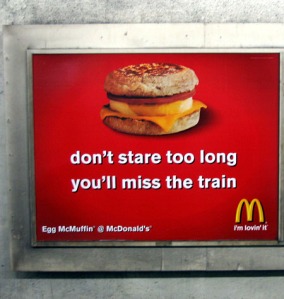
Take this advertisement for example:

mcdonalds_ad-Don't Stare Too Long

I found this picture online when I searched ‘McDonald’s advertisements’ on Google. Obviously, it is a picture of an advertisement, but we’ll pretend for the moment that we’re seeing it in person.

Imagine there were no text on the advertisement, and just a picture of an Egg McMuffin. Sure, many people would still see it as an advertisement, but it would also lose a lot of potential viewers in the noise surrounding it. These days, don’t pictures of fast food remind us of things like hear disease, obesity epidemics, animal cruelty, and minimum wage concerns as much as they remind us about the food itself? The Egg McMuffin is not innocent, and McDonald’s knows this.

The anchor text of the image reads, “don’t stare too long[,] you’ll miss the train”. Here, McDonald’s is distracting us from the rest of this contextual noise and making us see it as they want to see it: desirable. But I don’t think McDonald’s expects anyone to actually think, Aw man, I almost missed my train because I was so lost in the beauty of this Egg McMuffin! Good call, McDonalds. More likely, McDonald’s wants us to pick up on their intertextual play with sexual phrases. The “don’t stare too long” is just a textual equivalent of the quintessential American scene wherein the gawking male momentarily loses his wits while checking out a woman. Or, in linguistic form, something along the lines of this:

My eyes are up here

The McMuffin advertisement gets even more interesting once you look at its placement within the frame. We might expect the text to be somewhere on the bottom, in some more marginal position while the image engulfs most of the space. However, the anchor of this advertisement consumes half of the picture, given an equal prominence to the McMuffin itself. Whereas most advertisements idealize their products at the center of the picture, McDonald’s does not. It’s almost as if McDonald’s, through their suggestive language, is acknowledging that it is unhealthy—something less like food and more like a casual encounter with a stranger. And by making the text as prominent as the image, the reader is gestured to consider the guilty proposal as much as we are the product.

After all of this, I’ve come to see anchors as not only holding down a meaning for the picture, but also as attempts by certain parties to anchor the reader/viewer, to try and sway us away from the more prevalent—and perhaps more important—meanings behind objects. We, as consumers and citizens, need to remain critical and skeptical, so as not to fall under the spell of such textual hypnotics.

Proposal: With These Hands

I would like to photograph the hands of people as they go about their daily activities.  I would not photograph faces, but would focus solely on the hands and their various trials.  The photos should show differences for blue collar and white collar jobs, for class differences, and how much the subject cares about themselves and their own appearance (in the sense of hygiene and public appearances).

After this, I will ask the subjects for a picture of their hands with open palms, and ask for a brief account of how they define themselves – as a friend, a mechanic, a student, etc.

I want to do this project to see the differences between classes of people, the way they define themselves, and if those are correlated at all to how much they “use and abuse” their hands.

There should be less ethical dilemmas with this photo essay than my other proposals because the subjects are actively participating in the photos.  That’s not to say they will be posed, but I do not need to hide my intentions in order to get candid shots.

I will use a digital camera to take these pictures, perhaps altering the color and clarity of the photos depending on the hands in the photograph, to emphasize specific lines and features that may not be visible in normal conditions.  I also have a Minolta XG-M that I may use to control the focus more, and I would not need to worry about being apparent as I did with the other proposals. I want to experiment with wrapping each of the cameras in saran wrap to see the effects of that as well.

Proposal (Take 2): A Mile in Their Shoes

As a new topic for my photo essay, I would like to focus on the subject of shoes.  This ranges from athletic shoes to dress shoes to the beat up comfort shoes of those who can’t afford them, along with the situations in which the shoes are used.  While I will focus on photographing singular pairs of shoes in their specific context, I would also like to branch further and look at the contexts of shoes when they are not being used.

I am interested in this topic because I think it is a good example of the way people portray themselves, and the way that people judge others.  Even if shoes are useful to a certain situation, there are nuances in the types of ways that people use shoes to identify themselves.  I, for example, cycle through a couple of my favorite shoes because I care more about being comfortable in daily activities.  On the other hand, my sister is running out of places to store them in her room because each pair of shoes matches a different outfit.

There will be some ethical issues (like my first proposal), although there will be less stress on getting candid photos.  The subjects may be aware that I am taking their picture without effecting the general purpose of the photo.  However, in some cases where candid photos may serve a greater purpose, I would still be photographing people without their permission.

I will use a digital camera to take these pictures, perhaps altering the clarity of the photos depending on the shoes in the photograph.  A photo of more beat-up shoes, for example, will have less clarity than a photo of stilettos.  I also have a Minolta XG-M that I may use to control the focus more, but it would not be as inconspicuous as a digital camera in these public spaces. I want to experiment with wrapping each of the cameras in saran wrap to see the effects of that as well.

Proposal: The Distance Between Us

I choose option one for my photo essay, in recording my own series of photos.  I want to look at the physical distance between people as they communicate, from complete strangers to close friends.  I want to capture the body language that we use every day subconsciously, to show how our feelings change our body language.

To do this, I will attend at least one open, public event, like a comedy show or band event.  The people at this location will not feel an obligation to look in a specific direction, like at a performer, as that will effect the way that they stand with each other.  I will photograph all types of people as they go about their regular social activities (hopefully without looking like a creep).  I only want to attend one event because the people there will have a specific interest, say, as one larger social group, and I will not need to worry about standing distances across cultures.

I want to do this project partly out of curiosity and also because I am interested if I do the same things as everyone else.  Or, if there is a significant pattern in the way that a majority of people with the same types of feelings stand with each other.  In particular, how people in love act around each other and their relationship status.

I will use a regular digital camera so that I do not draw attention to myself, perhaps muddling with the clarity of the photo to emphasize the status of the relationship in the photo.  That is, the people in focus will also be in focus, and the rest of the photo will be slightly blurred. I can also try taking the pictures with a disposable camera, if I want a more personal feel.

When Friends are Marginalized Together

Movie posters reflect the specific genres of the movie that you are about to watch.  Maybe you’re in the mood for a sappy love story, or maybe an insane tale about friends getting to know each other better.  How can we tell the difference between friend movies and relationship movies?

Sean Hall’s concept of Center and Margin gives us an easy way to analyze movie posters and see which relationship the movie is going to be about.  According to Hall, the center of an image is the central focus, where the viewer’s eyes are drawn first, and that the rest of the image is centered around.  The center is the idealized object in the picture.  But something idealized also means that something is not idealized.  These objects are marginalized, less in focus and less significant than the central object.  Every object that is centered creates something that is marginalized.

On movie posters, it is mostly easy to see that the main character is the center focus of the film.  On the Star Trek movie posters, Captain Kirk, played by Chris Pine, is the center and idealized in a couple of ways.  He is in front of his companions Dr. Spock and Uhura, literally closer to the viewer.  He is at the very top of the poster, symbolizing idealization.  He’s also pictured more than once: there’s a tiny second him Kirk the bottom of the poster in the middle of an action sequence.  Kirk is the main character.  Spock and Uhura, important and recognizable enough to make it onto the poster, are secondary characters, revolving around Kirk’s storyline.

Star Trek Movie Poster

Source: Impawards.com

Action movies, horror movies, love stories.  These movies all clearly show who is the most important and who is marginalized.  They show who the movie is going to follow around and who the viewer is supposed to identify with.

This slideshow requires JavaScript.

Movies about friends, where the whole point of the movie is building on friendship, are another story.

Movies that are based solely on friendships tend to not have a clear distinction between the center and the margin.  Not that there isn’t a center to the movie poster, but the distinction between which character we should be paying attention to isn’t clear.

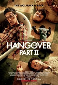
If you look at the Hangover Part 2 movie poster, for example, your eyes aren’t necessarily drawn to any of the characters in particular.  All of the characters have this idea of “centrality” about them.  Alan is at the top of the page, where Kirk was idealized before.  Stu, on the left, is almost the most central, and is certainly closer to the viewer because he is higher up off the ground, in the bathtub.  Phil is making direct eye contact with the viewer, the only one that openly faces the front of the poster.  Even if Alan is face up, his eyes are closed, and Stu’s body position is slightly turned away.

Source: impawards.com

Source: impawards.com

Remember that the key ideas for a central image are its location on the page and its orientation to other objects.  The point of view of the poster is from the top-looking down.  The characters are literally subjected to begin with, aligned with your lowered standards because the viewer is in the position of authority.  Plus they’re laying on the floor.  But they are all together in this position.  All three of them are marginalized from the point of view of the viewer, but none of them is a central figure on the poster itself.

The viewer can then conclude that the movie is going to be about the friendship of the three men, each of them equally as important as the next, rather than following the story from the point of view of one man.  Their friendship is the central image – in this case, the center of the triangle that their sprawled bodies create.

Other friendship movies have the same characteristics: a lack of a center and margin, or where all of the characters are central images, or all of them are marginalized images.

This slideshow requires JavaScript.

Of course, there are always exceptions that result from clever advertising.  But this is one way that the viewer can see what the central focus of the movie is going to be.

Othering Mashup: At First Glance


Reflection 1: On Video Composing and Writing

Creating a message within new mediums always creates new and unexpected challenges.  I have been writing all my life, honing and crafting the various ways to create meaning for audiences.  Composing a mashup took me out of this comfort zone as I learned to make meaning in new ways.  Through my struggles I learned the specific ways that creating a mashup was like writing and the ways that a mashup was a unique medium.

First, the process of composing is very similar to the process of writing.  My video editor of choice, MAGIX Movie Edit Pro, needed to become another type of tool just like the pencil.  The video editor was only a method of composition, but I couldn’t depend on it to make a message for me.  I needed to be fluent in knowing how to use the editor, until I could use it without thinking about it, just like I could use Word processor without thought.

This was the first time I had used a complex video editing program to compose, but MAGIX offered a relatively user-friendly alternative.  I first resisted the new technology but soon realized that I needed at least some of the new features, like manipulating time in clips or mirroring an image.  I allowed time to just learn the software, cutting and merging clips, rearranging them, and adding effects.  I didn’t create anything that made sense but I had a good handle on the things that MAGIX could do.  Working without goals first gave me time to enjoy the medium for all that it could accomplish.

In creating the mashup, I sometimes couldn’t find how to create a specific effect.  If I couldn’t find it in MAGIX itself, I would simply describe what I desired in Google.  Someone, somewhere was more knowledgeable.  For example, this tutorial showed me how to create ending credits after I struggled with the speed.

All in all, MAGIX wasn’t frustrating.  Most of my trouble came from intellectual problems rather than technical ones.  I can’t say that I have a mastery of the program, but I know how to find the answers that I need.

Elements of video creation also parallel the writing process.  I gathered my sources by watching clips, similar to searching through books or academic articles for the perfect quote.  It was more difficult in searching for the videos.  Images aren’t processed on search engines the same ways that words are, and my keywords had to be on point for any success.  I found myself recalling the videos I had watched for something that would be useful, like “when have I seen swarms of bugs?” I simply had to remember, or ask around, until the answer was revealed.

One of the images I knew I wanted to employ from the beginning was a child playing alone on a playground.  This spoke to me as a clear message of isolation: innocence should not sit alone in public.  YouTube search brought me to the short film “Awake,” where a teenager played alone on the swings.  This wasn’t particularly useful because he wasn’t innocent and seemed to prefer isolation.  However, the discovery wasn’t useless because it led me to two very relevant short films that I used extensively in my mashup: “Identity” and “Plastic.”  Just like a list of sources can lead to more relevant articles, the YouTube related videos brought me to images that I could use.

I needed to revise as I continued through the mashup as well.  Just like when, in writing, I realize one of my arguments is weaker than the others, I realized that I needed more footage to make a sufficient point.  For example, images of being excluded through family didn’t appear until the third draft of my mashup, but was a necessary contrast to home deconstruction.  Finding the Harry Potter footage was like finding the new, perfect source that should have been in a written composition all along: once it was there, the rest of the composition fell together nicely.  I did more research and kept revising until my mashup, like my writing, felt succinct.

When it came to making meaning, however, creating a mashup was vastly different from writing.  In writing, I chose each word and sentence carefully to argue my point.  Each choice, and most importantly, the thesis, are meant to guide the reader into my own opinion.

The mashup, however, left the meaning in the reader’s hands.  The viewer doesn’t know what my intentions were in including a section of video, so my argument is muted.  I have the swarm of bugs as a symbol to show that these creatures, in parallel to the problem, survives in various environments.  The viewer make read it differently: maybe they are disgusted by bugs and become uneasy about the rest of the video, or maybe they read the swarm like there is no containment to the problem.

In a mashup, the viewer determines what they take away from my work, and their interpretation makes the difference, like reading a poem.  Yet I definitely wanted to get a point across. I began to think of the mashup as creative writing: we argue for a feeling and an overall message rather than a strict way of thinking.  Just as a poem can be read in many ways with vastly different moral outcomes, the mashup can be interpreted in multiple directions.

For example, T.S. Eliot’s poem “The Waste Land” has one famous line, “these fragments I have shored against my ruin.”  Readers interpret this line as either he is protecting himself with the fragments that he has collected, or that the fragments are a showcase to his downfall.

My mashup can be read in the same style: in many ways.  Viewers may see it as the community gives you a place of respite when all others abandon you, or that each person is hiding their identity no matter what.  This may not be my point, but in using incorporating juxtaposition I have created something for them to see.  My message doesn’t matter because viewers will still have formed some conclusion about othering that they didn’t have before.  I only wish I could hear the interpretations.

Creating a mashup, therefore, was a form of creative writing for me, in which I used a tool to create meaning left open to the interpretation of the reader.  It is a tool I hope to employ in academic projects and personal life in the future.

Reflection 2: My Mashup, Semiotic and Remix Theories

Othering Mashup: At First Glance reveals the ways that people are othered, both from their respective communities and from each other, by enhancing the isolation of each individual in and among specific communities.  This meaning is created by the interpretation of the reader.  More importantly, the mashup can be read in light of many semiotic theories about how meaning is made.

A majority of the meaning in mashups is made through juxtaposition, or the intentional placement of two images next to each other to create meaning.  As Jason Palmeri, in his article The First Time Print Died: Revisiting Composition’s Multimedia Turn, explains, mashups must be read in a associative manner, “looking not just at how everything on one page or in one chapter is connected but rather looking at how fragments from diverse pages might be reassembled to create new compositions” (101).  The message of the mashup becomes dependent on how the reader determined that each clip related to the others.

In my own mashup, I carefully juxtaposed clips to give the audience a specific message.  At 1:26, the image of a bug burning under a magnifying glass is juxtaposed with the image of a girl covering her face with a mask.  The message to the reader is that the intentional harm to another creature is a reason to cover your true identity: letting anyone past the mask you present to society will become dangerous if they do not value your life, like they do not value the life of the bug.

In order to completely understand the juxtaposition, the viewer must first consider the various semiotic theories at work.  The mask itself is a metonym, or, according to Sean Hall, in his book This Means This, This Means That, “when one thing is substituted for another” but that the reader can interpret based on associations made in their society (56).  The mask is a metonym for identity: when people try to create a new identity, they put on a figurative mask of the new person that they want to be.  With this image, I brought in the idea that the way a person identifies him or herself depends on how they believe society thinks of them.

The viewer then must also consider how the bugs act as a symbol.  According to Hall, a symbol is “any sign where there is an arbitrary relationship between signifier and signified” (32). Each image recalls another larger idea that may or may not be obvious.  To me, bugs are a common symbol of perseverance and outliving all modes of destruction.  In this specific clip, the bug squirms, but lives, under the heat of the focus of the magnifying glass.  Even with the specific intent to burn the bug, the bug never dies.

If the viewer also considers the intratextuality of the image of the bugs, the idea of survival is reinforced further.  Intratextuality, according to Hall, is the way an image relates to itself when it appears multiple times in the same work (126).  The image of the bugs transforms from being uncontained at :31, to withdrawn from at 2:50, to studied and scrutinized at 3:21 and 3:18.  No matter what environment they are placed in, the bugs still survive.  Even though the bugs appear weak when being burned, isolated and vulnerable, they are surviving just like in any other image.  The fact that the magnifying glass appears to dominate makes no difference when compared to the rest of the images.

In between these two images is a gutter, what Scott McCloud, in his book Understanding Comics: The Invisible Art, explains as a place that the “human imagination takes two separate images and transforms them into a single idea” (66).  The image of a bug burning and a mask do not have an obvious relationship to each other.  But because the human mind wants to create meaning where we believe there should be meaning, we relate the two images together into one whole unit.  Even if the viewer does not understand the various forms of meaning like the metonym of the masks or the symbolism of the bugs, they can still understand that the violence done to the bug – by killing it, by burning it – is a reason for a person to be afraid and hide who he or she really is.

At another moment in the mashup, at 3:48, each of the faces that have been seen throughout the mashup, looking in different directions, come together to all look at each other.  A young boy alone on a playground looks left and begins an exchange of glances in which each person in each clip looks in the proper direction to return the glance.  The message behind this selection of glances is that the communities of each of these individuals, while outcasting them, also forces them to outcast each other.  In other words, the othering that is developed in a community reaches farther by othering anyone that is not exactly like you.

The looks of each of the individuals is an example of Hall’s idea of center and margin.  In this theory, the object in the center is the most idealized, but creates a margin of things that are not the focus and therefore have less importance and less status (98).  Because none of the individuals are the central focus in this montage, each one of them becomes marginalized.  Their juxtaposition allows the reader to see each of the individuals looking at the next one in a circle, where no one is happy and no one has found a true sense of community.

These glances depend upon their intertextuality, when the context of the original clip adds a new level of meaning to the clip itself.  Chuck Tryon, in his article Reinventing Cinema: Movies in the Age of Media Convergence, notes that “movie remixes, through a complicated renegotiation of intertextuality, illustrate the degree to which texts work in constant dialogue not only with other texts but also with audiences themselves” (173).  In other words, when the audience understands the context they will be able to pull more meaning from the mashup.  For example, the young boy, Ben (at 3:47), is a clip from Daddy Day Care.  In this moment in the movie, other children are playing on the playground beside him, but not with him.  He isn’t necessarily discontent with his loneliness in the movie, even though he does want friends.  Knowing this context would add to the sense of isolation: Ben is more lonely because he cannot connect with others, no matter which direction he looks in trying to find friends.

Other glances can be read in the same way: each of the individuals is outcast from his or her original social circle.  Harry Potter (at 3:54), from the Harry Potter franchise, is othered by his foster family, the Durselys.  Castiel (at 3:50), from Supernatural season 7, episode 1, is othered by members of a church group.  The young girl wearing a mask (at 3:52), from the short film Identity, is othered by the other students at her school.  If the viewer can understand the intertextuality of all of these moments, he will have a true sense of the isolation and othering created when all of them look at each other.

However, as an example of noise, in which the message is not transmitted with the writer’s original intentions, the reader is likely to not understand the context of all of the clips.  Luckily, they will only need to read so far as interpretation of gesture to create the same meaning that the intertextuality defines.  In western society, a frown is generally a closed gesture which does not welcome others into a conversation.  When all of the characters share similar expressions, all of them are excluded from each other, highlighting the ways that they are each marginalized.  The prominence of each of these faces throughout the mashup leads the reader to this moment, to the epitome of loneliness.  The girl with the mask, in particular, even draws the reader back to the symbolism of the bugs and survival under all conditions, so that they don’t have to know the context of the original image at all to understand her purpose in the mashup.

As a final point for this moment in the mashup, the glances also reflect Hall’s concept of sameness and difference.  In this theory, Hall argues that the only thing that separates one face from another is the viewer’s own perception of difference (74).  We can chose to see one as different because she is a woman, or because one is wearing a mask, or because one is significantly younger than the others.  At the same time, we can also choose to see no difference at all, relating each person because they are human.  With this theory in mind throughout the mashup and exemplified in this moment, I urge the viewer to see that there is no need to other people that are different because there is always at least one similarity that links two people together.

These are a scarce few examples of how Othering Mashup: At First Glance can be seen through semiotic and remix theories.  The associations and theories are endless in application, but I hope that the few examples of specific moments that I have outlined here create a clear picture of the thought process behind the clips in my mashup and the complicated way meaning is created in mashups in general.  These associations argue for the general acceptance of all people, and the careful consideration of the communities that build identity.

Parody vs. Copyright: Court Case Examples

In previous blog posts, I discussed the eerie similarities between movie posters.  Despite the fact that many of the posters have the same visuals and overarching theme in order to target the same audience, most of the artists that create movie posters agree that it is not copyright infringement because enough has been changed: the font, the characters, the background.  Originality in movie posters comes from the “inspiration” of other posters that were effective.

Other artists have sued over movie posters, however.  In a 1987 court case, artist Saul Steinberg sued Columbia Pictures Industries, Inc. for copyright infringement of his art.  Steinberg argued that the movie poster from Moscow on the Hudson was too similar to his original work, View of the World from 9th Avenue, published on the cover of The New Yorker.

If we compare the two images, we see the striking similarities that Steinberg argued for.  The color and shadow (down to the angle of the building), the use of cars and lettering on the street, the perspective of Moscow and the Pacific Ocean, respectively.  Even the lettering for “The New Yorker” and “Moscow on the Hudson” is in the same font style, a font that The New Yorker often utilizes.

Columbia Pictures Industries, along with many other movie and record companies being sued for the association of the poster, argued that they were using the poster under the fair use factor, parody.  Stanford University easily summarizes the definition of parody: “In a parody…the parodist transforms the original by holding it up to ridicule.  At the same time, a work does not become a parody simply because the author models characters after those found in a famous work.”  A parody, in short, must highlight the extremes of the nature of a work to make another point about it.

Judge Louis L. Stanton believed, in this case, that Steinberg had created the parody about New Yorkers by arguing their perspective about the world, not the movie poster.  Columbia Pictures Industries, Inc. may have found inspiration in Steinberg’s work, by had only borrowed the parody that Steinberg created instead of making their own.

Because they were not arguing for anything else, but using the poster to argue the same effect as Steinberg, Steinberg won his court case on the grounds that too much had been copied.  Judge Stanton believed that the perspective itself was not copyright (the poster was free to use the subjective perspective of New York citizens), but the use of other similarities was indeed a copyright infringement.

As a comparison, a movie poster for Naked Gun 33 1/3: The Final Insult featured Leslie Nielsen’s head photoshopped onto the body of a pregnant woman.  The poster was a direct echo of a Vanity Fair cover featuring a naked and pregnant Demi Moore.  Photographer Annie Liebovitz, who had taken the picture of Demi Moore, sued for copyright infringement because of the way that the photo had been digitally manipulated to mimic her own style.

Courtesy BayCitizen.org

Viewers can see the similarities between the angle, shading, general composition of the photo and pose of the models.

However, Paramount won this case because of the notable changes they made to the picture as well.  First and most obvious is the change from Demi Moore’s face to Leslie Nielsen’s, and the expression that each wear on their faces.  Second is the size of the ring on the right hand of the model: Demi Moore’s is the general size of a wedding ring, while the other is more obnoxious.  Third, the lighting is significantly different.  On Vanity Fair, the light is soft and highlights the beauty of a pregnant woman.  On the Naked Gun poster, the lighting is crude and points out the obvious flaws of a man being pregnant.

Because of these changes and their implications in highlighting the differences between the pregnancies and genders, the courts concluded that Paramount Pictures Corp. was making a parody of the work.  They used the style of Liebovitz to make another point: there is something obnoxious and not at all beautiful about a man being pregnant.

Steinberg v. Columbia Pictures Industries, Inc. became a precedent case for when fair use did not apply and when parody was not effective.  Leibovitz v. Paramount Pictures Corp. became a case for when the images fell under fair use.  The distinction between commenting on or criticizing a work and simply copying it became clear.