semiotics

Fonts!

Since first starting working and creating posters I have become and addict to fonts and using them to communicate feelings and emotions. I often find myself looking and brands and logo and trying to decipher the hidden semiotics or meaning within the fonts. I decided to do my own little experiment. By having two coworkers who…

A. Use the computer daily

B. are female

C. are within the same age range

D. are intelligent

E. are my friends (Only a few people would like to take time away from their breaks for me)

I wanted to see how they viewed font compared to each other and compared to myself and the creator of the fonts. I should apologize now for the green ink, I don’t know what Person B was thinking.Image

Here are the real names of the fonts. All fonts were from Google and yes, they are all free!

1. Schoolbell

2. Lilly

3. Engagement

4. Lobster

5. Arizonia

6. Graduate

7. Punch Drunk

8. Flavors

9. Wendy one

10. Mountains of Christmas


What I loved about each person descriptions was how unified each person’s was. Person A used all NAMES while Person B used all ADJECTIVES. I happen to directly know some of Person A’s people of which she named the fonts after ‘Dexter’ or Mountains of Christmas is her sneaky beagle and ‘Brendan’ or Wendy One the ECON professor. She also used pop-culture references from Charlie Brown. I was amazed by her characters of each font and how for her, it directly related to a person in her life. Person B on the the other hand used terms and definitions almost for her font names and descriptions. She also happens to work in PR & Marketing at the College while the other is an Administrative Assistant. For both of their names for ‘Graduate’ they were spot on. Person A deemed it Varsity and Person B deemed it Collegiate.

I really want to show each person what the other said about the font so that they can see if each others relates at all. Is Person A’s people match the descriptions Person B gave?

It is amazing to see semiotics at use and the amount of detail and emotion a font can convey to different people. It is all perspective, and we all have a different one to use in learning.


Sexism and Racism in Sport Ads

While I hate to bring my blog post back to where I work I’ll do it again! Occasionally outside companies bring our department their flyers to hang up. The gentleman who handed me the flyers was tall, muscular, and dark haired.  I won’t name the company of which he represented but the organization encourages college students to join club sports teams and engage in their social parties. I was quickly amused at the company flyers, instantly thinking they were comical. He left and I placed the fliers in my ‘to hang’ bin and went back to my work.


A few days past and I hung grabbed that same bin to hang up all the posters for the week. I first went to the community board and grabbed two the company’s flyers. I stopped, thumbtack in hand and looked at them. I became distraught and angry. Instead of wanting to join the business’ teams or having fun at their parties I was disgusted by their image. Each image displayed the confirmation of perceived stereotype. In one hand I had a ‘thick’ aggressive looking field hockey player with her mouth guard sticking out of her mouth and in the other I had a thin blonde turning her back to the camera to show her back dimples and baseball jersey. Just these two images juxtaposed together made me feel as if girls who play these sports come from completely different backgrounds.

“Now you, pick up the field hockey stick and look at me with anger in your eyes. Be fierce, be bold.” I can hear the photographer shout at the mode. The female hockey player showed me a masculine or ’butch’ side of women. Image

And then, there is the sexy baseball jersey wearer showed me how women are used as models. Why would the girl appear to be participating in the sport? 

“Roll up the jersey a bit and turn around but give of us a sultry look. You know what; roll it up a little bit higher.”

Image

Additionally there were four other images other flyers with different images. One, featured basketball and another, dodge ball and football. These three images really got me thinking. Firstly, I have always thought of basketball to be predominantly African American. In fact, from the 2013 Racial and Gender Report Card: National Basketball Association, “African-Americans comprised 76.3 percent of all NBA players. Eighty-one percent of players were players of color.” I found it odd or misrepresentative that the player featured for basketball was a white male.

The PR department probably mulled that over for hours.

“He can’t be black. We can’t be racists, pick a white male instead. Good character, right?”

He seemed, to my own standards ‘good looking and kind’.


Image

Compared to the basketball player, the dodge ball African American appeared dull and harsh. The man nonetheless wore gloves and held a dodge ball, a sport best related to elementary school. Dodge ball has been notorious for the game to pick on the weak and rally the strong, and game that separates. Ironically, a black male was chosen to represent this sport.

Image

Then the next male model represented football. This model was ferrous, sweaty, mean, and ugly. His face showed pure anger.

The photographer probably told him, “Squeeze the football like it’s someone’s head.”

Showing me anger and dominance I felt nervous look into his eyes. He was strong and powerful and I being a small, 120 lb woman, would not be able to handle him if he chooses to attack- I felt scared.

Image

The last image, which was juxtaposed right after the angry football player, was disgusting. Soccer was displayed this time. But the model… she wore no bra, exposing her nipples and her hips bones stuck out of her skin. I don’t mean to say she was overly skinny, but she certainly wasn’t hiding anything. Like the baseball jersey model she exemplified the female body as an object. Her sexy stare into the camera wasn’t one I’d see on a competitive player.

Image


I was ashamed of these ads, astounded by the sexism and racism by six flyers. At first glance I laughed, but when I really examined them my secret semiotican came out. I decided to only hang up a few of them. I threw out the sexy soccer player, baseball and football player. I places the normal basketball player and on another bulletin board, the dodge ball and field hockey together. I didn’t want to showcase sexy, or rough. I wanted wholesome competitive, sport play. Of what that is now, I am not so sure. 

Disconnected: A Photo Essay Refections

Disconnected: A Photo Essay explores the relationship between hands, shoes, and our personal identities.


Reflection 1: On the Choice of Camera and Photographs

There were a number of possibilities for the camera that I could use in this project.  Should I use a disposable camera in order to reflect the idea that we treat our hands as disposable objects, ready to be used and then discarded until future use?  Should I manipulate the images with filters and cropping to draw attention to specific moments?

After careful consideration, I chose a digital camera, a Sony Cybershot DSC-W530.  There’s nothing inherently special about this camera: the features are for the ease of amateur photographers, not intending for the user to be overwhelmed by possibilities.  This camera best suited my needs in a couple ways.

First, a digital camera captured the texture and detail of the hands and shoes.  The lines, wrinkles and age spots wouldn’t appear on a disposable camera the same way they would on a digital camera.  The shadows in the mesh or fabric of shoes were brightened and intensified by using the digital camera.

More detail, the kind a more advanced camera captures, would have greatly enhanced the focus I was trying to portray.  However, in weighing my options, I chose instead to capture natural images of people who were comfortable with being photographed.  Even with a simple camera, when I first began taking pictures, I got a series of questions signaling their discomfort, especially those I didn’t know.  What did I want them to do with their hands?  What was the purpose?  How many people were going to see?  These first photos felt staged and awkward because the subjects were so uncomfortable.  They didn’t show the natural dichotomy between hands and shoes that I was looking for.

Using a digital camera also allowed me to “sneak” some pictures.  Digital cameras don’t draw attention to themselves the same way professional cameras do: nearly everyone owns a digital camera in this technological age, even if it’s the one built into their phones.  If I had a digital camera out, looking at the screen, others did not spare a second glance.  To counteract some of the nervousness of the subjects, I could take the photos of their hands first and inform them after, showing them the pictures and asking their permission to use them in the essay.

In this technique I captured a series of photos from various subjects.  I carried a camera with me everywhere I went, always on the lookout for interesting activities.  I photographed many people in order to have a wide variety of tasks to show in the essay.  The more I photographed, the more I became aware of the best light, the best angle.  For example, in one photograph, the subject wanted to light a cigarette.  If I looked at his hands from behind, where he was shielding the lighter, his hand was dark and difficult to see.  From the front, the flame became a central focus, illuminating both the lines on his hands and the scene around him.

After taking the images, I edited all of the photos in Picasa.  This relatively simple editor allowed me to adjust the images of hands by adding a soft focus, blurring the background so that the viewer paid attention to the detail of the hands in action.  I cropped each photo meticulously until each was aesthetically pleasing to the eye.  In some photos, I also adjusted the saturation and the shadows in order to draw out more details that the camera couldn’t capture on its own.  The photo of a woman holding up a stethoscope, for example, became more appealing through adding more shadows: all of the unique shadows in her hands were also heightened.

I chose the images in this photo essay not only for their aesthetic qualities, the ones that simply were the most intriguing after I edited them, but also for the way that the hands and the shoes spoke to each other.  How did the hands of a girl in slicing cheese in a deli slicer, equipped with hot pink nail polish, relate to her purple shoes?  How did hands flipping through a magazine relate to black leather boots, only half-laced?

These images told a story in themselves, of an identity trying to assert itself no matter what task the hands were meant to do.  The photos in the essay were chosen for their particular dynamic between hands and shoes, when the relationship was clear or when it called the relationship into question.  Juxtaposing the images with each other, and then with the words that the person used to describe themselves, brought the relationship between all three elements to the forefront.  Together, they crafted the identity of these twelve individuals.


Reflection 2: Composition and Rhetorical Theories of a Single Image

This photograph of a butcher cutting meat has been one of my favorites from the beginning, but it was not until I considered the theories of photography that I discovered why.

It is first aesthetically pleasing because it follows several key theories of photographic composition.  The Digital Photography School advocates the use of various textures for a more appealing quality.  Here, the contrast of the smooth, reflective knife blade contrasts with the rough lines of the hands, calling the lack of clarity in the hands themselves into question.  Knives, with one purpose, are clear.  Hands, with many, are worn down.

We are drawn to the knife because of its difference to the rThe Butcher's Hands
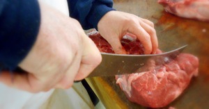
est of the photograph.  The knife, in turn, becomes a leading line.  As Photography Mad outlines, leading lines guide the viewer toward the subject and through the photograph.  Here, the curve of the knife blade directs the reader from one hand to the other, drawing importance to both actions.  The viewer sees how the subject holds the blade, with purpose and skill.  The way he holds the meat on the other end of the blade also speaks to his professionalism, drawing attention to the way the hands seem to act all on their own.

And where is the person behind those hands?  By cropping the subject out of the image, I emphasize how the importance of hands has been lost.  Photography Mad explains that the need for cropping arises when “the main subject is so small it becomes lost among the clutter of its surroundings.”  If the photo included a whole person cutting the meat, the viewer would focus on elements that more truly told the story, like his body language or his facial expression.  Not one glance toward the hands, but the whole picture of a person and his story.  In cropping, I narrowed the vision of the reader away from this man’s life.

In addition, the knife symbolizes power.  As Sean Hall, in This Means This, This Means That, explains, through a symbol, the “meaning that is created is related to the nature of the object” (32).  Those who wield knives have control over those that do not.  The butcher has control over that piece of meat, over the way it is sliced and the way someone else will receive it.  The focus of this image seems to reflect this amount of power.  If we follow the knife, we are brought to the hands that guide it.

Yet there is nothing inherently powerful about this image.  Errol Morris, in his book Believing is Seeing, argues that photographs do not make any arguments for themselves.  The arguments come from the ways that the viewer interprets the images: “Images are plastic, malleable, and lend themselves to any and every argument” (217).  They become a testament to the way that the viewer wants to see them.  We want to believe that the hands wield this power.

What is the truth behind this photograph?  Is the butcher empowered by his occupation?  Or is he stuck in a dead-end job, where his hands complete tasks mechanically and with no gratification?

I influenced this perception for the viewer by only showing the hands in a moment of power.  Morris believes that “the minute you select one photograph from a group of photographs, you are doing something very, very similar to manipulating reality” (164).  Here I only showed the deft movements and precise methods, but not the attitude or the emotion.  I created a powerful man by only showing this moment of power.

“Here is Your Garbage” Reflection

When choosing what kind of camera I’d use for my Photo Essay Assignment, “Here is Your Garbage“, I was a bit overwhelmed by the possibilities. Vaseline on a lens? Disposable cameras? Once again, I was forced to consider the technological dimension of composition, and how it is tied to the quality and effect of what I create. I’d have to make a decision that wasn’t based off of mere convenience; I’d have to consider exactly what I was trying to capture, and let that inform my decision on what type of camera to use.

When I decided on taking pictures of trash, I concluded that texture was a huge element that I’d want to capture. I wanted to show trash in shocking detail and texture—from the small pieces of glass blending into the sand, to the countless discarded items stacked in piles and heaps. To capture such detail, I concluded that a DSLR camera would best serve my needs. Using a Nikon D3100, I didn’t feel limited by the touchy focus of a camera phone, nor by the blurry, sharpness-lacking pictures from a disposable camera.

Once I had the camera, I still needed to know what to look for. The landfill, of course, contained a lot of trash. This place was definitely the easiest site to gain material. All over the place were piles of trash—televisions, chairs, tires, glass, plastic, paper. It was grotesque to see trash in such volumes, and capturing it made a powerful punch for my photo essay. But the photos from this place alone only showed half of what I wanted to show about trash. I wanted to show garbage in more mundane, approachable contexts.

I headed into Philadelphia the next weekend to take my last round of photographs. This was after our in-class workshop, so I had a fresh new set of questions and a sharpened critical sense to bring with me. When I got there, there were plenty of trash cans and dumpsters to choose from along with some construction sites with debris that would, as I presumed, get sent to a scrap yard—or perhaps even a similar landfill to the one I photographed the weekend before. It was all great, but I knew there had to be more, subtle things that I was missing. I was, after all, a member of my own audience; I needed to find the ‘waste’ that I and everyone else overlook.

I started looking in smaller places—areas behind the dumpsters in back alleys, potholes, the open spaces in sewer drainages. I found that these smaller places contributed just as much as the epic, voluminous heaps I had been photographing prior. For instance, I walked past the soda can lodged in the sewer drainage bars several times before seeing meaningful and aesthetic value to it. First of all, the diagonal lines of the metal bars served as an aesthetically-pleasing background to the can, which was so perfectly lodged between them. It cried out its own meaning—trapped in a sort of unintentional net from the hidden, underground collection of disposed cans beneath it—an unwanted but inevitable result of our consumption and disposal habits.

It was easy for me to manipulate them in Picasa after the fact. I scrupulously cropped every picture in my Photo Essay, but I also took some editing a bit further. I found that adding sharpness to some pictures intensified the texture. This came in handy for close-up pictures in particular, highlighting every little wear-crack in the shoes on page 16.

Also, adding saturation to my pictures made them a lot more vivid, and even retracted the view from the textures to the colors and text as was effective in some cases. My picture of the “All Natural Clean” container on page 4, for instance, was a lot more dependent on the text on the container than each individual piece of trash behind it. So, by adding saturation to the photo, I shifted the focus to the larger, bolder text—highlighting the irony of the words “natural” and “clean” on a plastic container in a landfill.

Finally, I feel that the soft focus tool in Picasa was fantastic—almost like a semiotic cheat code to bring the viewers’ focus to what I want them to see. In the picture wherein the bulldozer is pushing trash across a pile on page 5, I used the soft focus to direct the reader to the trash that is being pushed. Conveniently, this included an intact chair and what appears to be a suitcase. Now, the viewer can see the trash pile for its parts.


Photo Essay: The Image of a Child

Over the last few weeks I have been studying the medium of photography, a topic I have never really explored or studied before. I read not only about the historical signifance of photography from Alan Trachtenberg’s Classic Essays on Photography as well articles from the likes of Annette Kuhn, Victor Burgin and Susan Sontag, but I have questioned my own authority when it comes to taking photographs. To perhaps show off what I have learned in a very short time, I have completed a full-length photo essay by tapping into my own childhood and analyzing one photo based off of photography and semiotic theories. This is part memoir, part academic, but an interesting read none the less that relies on just one photograph. Click the link (that will direct you to ISSU) below:


The Image of a Child by Christina Maxwell

Semiotic/Comic Analysis of Coraline


Coraline: The Graphic Novel (Source: Amazon.com)

Coraline: The Graphic Novel (Source: Amazon.com)

I recently spent time reading and analyzing the graphic novel of Coraline, written by Neil Gaiman, illustrated by P. Craig Russell through the understanding of both semiotics and comic theory. The graphic novel is an adaption of Gaiman’s national bestseller that introduces us to a curious young girl named Coraline who discovers a secret, hidden door that takes her into an alternate world that is unlike anything she has ever experienced. In this world, she has a mother and father who are eager to spend time with her (unlike her distracted, “real world” parents), but with considerable strings attached. While I enjoyed the story, I was interested in how I was going to understand this graphic novel, which I will admit is a genre I do not usually read.

Continue reading

The Anchor: You Know You Want It

I’ve been thinking a lot about the word anchor since reading Ronald Barthes’s “Rhetoric of the Image”. Let me start from the beginning, though.

Before defining the word, anchor, Barthes establishes the probably that “in ever society, various techniques are developed intended to fix the floating chain of signifieds in such a way as to counter the terror of uncertain signs…” In other words, every picture has an infinite scope of contextual potential. So, with such a wide array of possible meanings for a picture—varying by who is looking and when/where they are—pictures need anchors, or something to provide “control” and “bear a responsibility—in the face of projective power of pictures—for the use of the message.”

Take this advertisement for example:

mcdonalds_ad-Don't Stare Too Long

I found this picture online when I searched ‘McDonald’s advertisements’ on Google. Obviously, it is a picture of an advertisement, but we’ll pretend for the moment that we’re seeing it in person.

Imagine there were no text on the advertisement, and just a picture of an Egg McMuffin. Sure, many people would still see it as an advertisement, but it would also lose a lot of potential viewers in the noise surrounding it. These days, don’t pictures of fast food remind us of things like hear disease, obesity epidemics, animal cruelty, and minimum wage concerns as much as they remind us about the food itself? The Egg McMuffin is not innocent, and McDonald’s knows this.

The anchor text of the image reads, “don’t stare too long[,] you’ll miss the train”. Here, McDonald’s is distracting us from the rest of this contextual noise and making us see it as they want to see it: desirable. But I don’t think McDonald’s expects anyone to actually think, Aw man, I almost missed my train because I was so lost in the beauty of this Egg McMuffin! Good call, McDonalds. More likely, McDonald’s wants us to pick up on their intertextual play with sexual phrases. The “don’t stare too long” is just a textual equivalent of the quintessential American scene wherein the gawking male momentarily loses his wits while checking out a woman. Or, in linguistic form, something along the lines of this:

My eyes are up here

The McMuffin advertisement gets even more interesting once you look at its placement within the frame. We might expect the text to be somewhere on the bottom, in some more marginal position while the image engulfs most of the space. However, the anchor of this advertisement consumes half of the picture, given an equal prominence to the McMuffin itself. Whereas most advertisements idealize their products at the center of the picture, McDonald’s does not. It’s almost as if McDonald’s, through their suggestive language, is acknowledging that it is unhealthy—something less like food and more like a casual encounter with a stranger. And by making the text as prominent as the image, the reader is gestured to consider the guilty proposal as much as we are the product.

After all of this, I’ve come to see anchors as not only holding down a meaning for the picture, but also as attempts by certain parties to anchor the reader/viewer, to try and sway us away from the more prevalent—and perhaps more important—meanings behind objects. We, as consumers and citizens, need to remain critical and skeptical, so as not to fall under the spell of such textual hypnotics.

The Symbols Inside the Devil Inside

With all movies (barring documentary) we, as viewers, are aware that what we are seeing is not true. We know the “sender” is telling us an elaborate lie — a story — and we have to suspense our ability to disbelieve in order to fully immerse ourselves in a movie-watching experience. Horror is especially adept at crafting this lie: Paranormal Activity, The Blair Witch Project, and a variety of other movies play on the idea of “found film” so make what we’re viewing so much more real. But it’s not enough to merely give the viewer these “recordings,” a viewer must be able to relate, to read all the signs, in order to feel the true impact of a horror film.

I wanted to look not at a concept of horror film for this entry, but at a film itself. I’ve previously discussed the fear of the unknown, the use of religious images, and the use of color in horror. The Devil Inside uses all of these concepts and far more in its story, and while neither the best nor my favorite film (I found it mostly middle-ground in terms of horror), I decided to look at how symbols and semiotic concepts are used, specifically, in this film.

The Devil Inside Movie

Also, it was available on Netflix.

The film begins with a purposeful attempt to blur the lines of reality. This is not just found footage: We are shown crime scene footage (quite dark, despite being in a house, where lights exist — but camera-flashlights add so much tension!), and a clip from a newscast before centering in on an interview with Isabella Rossi, the daughter of the woman who committed the murders from the crime scene footage. All fake, and all carefully crafted, the film wants us to believe we are watching a documentary, even when falling on some of the most commonly stereotypical horror tropes. (At the end of the crime scene footage there is an unknown sound before the camera cuts away. Spooooooky.) It wants to create that fear of the unknown, somethings expanded upon even farther as the film begins: We see a broken chair, a dead priest, and a woman clutching a cross before we hear the words “exorcism.” Even without seeing a preview, the film makes use of painfully obvious symbols to foreshadow the overall point of the movie. It does this far more subtly, a number of minutes in, as Isabella sits in on a class at the Vatican School of Exorcism (not a real school), and we conveniently hear mention of the transference of demons. Gee, I wonder what will happen later. It’s in these beginning scenes that the film sets the stage for it’s own mythos and intratextuality that we need to accept as viewers. Without our relation to these first moments of film, the rest of the movie would not work.

There are also times where the movie relies heavily on color — although these scenes are few. When Isabella goes to visit her mother in the mental hospital, we see camera footage of her mother. The film appears black-and-white, but for the dull color of a yellow chair. Incidental? Maybe, but also perhaps a moment of calm brightness to contrast the next color in the scene, which is the red of blood, standing out even brighter. The scenes in the hospital themselves are nothing special: The video is dull, normal “found footage”-style fair, which doesn’t seem the match the crisp realness of the other documentary camera moments, but does work to show the somber nature of a mental hospital.

Shortly after that first hospital visit, we are shown a mash-up, of sorts. Isabella voices over what it’s like to effectively lose both her parents. As she does this the video switches between Isabella walking by herself in crowds of people, religious imagery, statues that represent loneliness. These images are quick moments, the get us a feeling of loss and being lost. Even though she has a camera man/documentarian with her, Isabella is alone. She has no parents, no hint of a significant other, and it is earlier-hinted that she has had an abortion, which could be a symbol of literal emptiness insider her. A similar voice-over mash-up moment happens shortly after when a young priest discusses his background with exorcisms.

This film also falls back on the perversion of religion. “Inverted crosses, commonly used in Satanic rituals.” But we’ve already discussed the problem with that. Later we move on to a young girl possessed by a demon, containing some more apparent symbols: “She’s getting worse,” her mother warns, saying she moved her to the basement. She’s getting worse, so she is physically getting lower, getting put in a dark, dank space, and closer to Hell.

DI_52

It’s here we get to view our first “real,” brutal exorcism and demonic possession. And the demon shows in the young girl’s body: She is contorted and ugly, marked by bruises, blood, and dirt. The demon is not elegant, and neither is this girl. She wears her possession like a gown, so the characters and the viewers both can understand that even if the Devil can be subtle, smooth, and resort to trickery, demons are rough and obvious. They make a normally-pretty girl physically “wrong.”

These themes continue throughout the movie, mimicked in obvious and more subtle ways–generally the more obvious. This is not a movie with symbols twined in like a delicate thread, but it is still not a movie without its symbols. It is also a movie who keeps to one solid plot, and the later hospital scene and later exorcism are so similar to the one we see in the first half there is no need to reiterate. A choice that perhaps does not make for the most frightening of films, but does at least hold true to it’s own setting, and is a good example of common symbols and semiotics in horror film.

When Friends are Marginalized Together

Movie posters reflect the specific genres of the movie that you are about to watch.  Maybe you’re in the mood for a sappy love story, or maybe an insane tale about friends getting to know each other better.  How can we tell the difference between friend movies and relationship movies?

Sean Hall’s concept of Center and Margin gives us an easy way to analyze movie posters and see which relationship the movie is going to be about.  According to Hall, the center of an image is the central focus, where the viewer’s eyes are drawn first, and that the rest of the image is centered around.  The center is the idealized object in the picture.  But something idealized also means that something is not idealized.  These objects are marginalized, less in focus and less significant than the central object.  Every object that is centered creates something that is marginalized.

On movie posters, it is mostly easy to see that the main character is the center focus of the film.  On the Star Trek movie posters, Captain Kirk, played by Chris Pine, is the center and idealized in a couple of ways.  He is in front of his companions Dr. Spock and Uhura, literally closer to the viewer.  He is at the very top of the poster, symbolizing idealization.  He’s also pictured more than once: there’s a tiny second him Kirk the bottom of the poster in the middle of an action sequence.  Kirk is the main character.  Spock and Uhura, important and recognizable enough to make it onto the poster, are secondary characters, revolving around Kirk’s storyline.

Star Trek Movie Poster

Source: Impawards.com

Action movies, horror movies, love stories.  These movies all clearly show who is the most important and who is marginalized.  They show who the movie is going to follow around and who the viewer is supposed to identify with.

This slideshow requires JavaScript.

Movies about friends, where the whole point of the movie is building on friendship, are another story.

Movies that are based solely on friendships tend to not have a clear distinction between the center and the margin.  Not that there isn’t a center to the movie poster, but the distinction between which character we should be paying attention to isn’t clear.

If you look at the Hangover Part 2 movie poster, for example, your eyes aren’t necessarily drawn to any of the characters in particular.  All of the characters have this idea of “centrality” about them.  Alan is at the top of the page, where Kirk was idealized before.  Stu, on the left, is almost the most central, and is certainly closer to the viewer because he is higher up off the ground, in the bathtub.  Phil is making direct eye contact with the viewer, the only one that openly faces the front of the poster.  Even if Alan is face up, his eyes are closed, and Stu’s body position is slightly turned away.

Source: impawards.com

Source: impawards.com

Remember that the key ideas for a central image are its location on the page and its orientation to other objects.  The point of view of the poster is from the top-looking down.  The characters are literally subjected to begin with, aligned with your lowered standards because the viewer is in the position of authority.  Plus they’re laying on the floor.  But they are all together in this position.  All three of them are marginalized from the point of view of the viewer, but none of them is a central figure on the poster itself.

The viewer can then conclude that the movie is going to be about the friendship of the three men, each of them equally as important as the next, rather than following the story from the point of view of one man.  Their friendship is the central image – in this case, the center of the triangle that their sprawled bodies create.

Other friendship movies have the same characteristics: a lack of a center and margin, or where all of the characters are central images, or all of them are marginalized images.

This slideshow requires JavaScript.

Of course, there are always exceptions that result from clever advertising.  But this is one way that the viewer can see what the central focus of the movie is going to be.

Mash-Up Reflection (Part Two)

Putting meaning into a video mash-up isn’t only easy, it’s inevitable. Two pictures, videos, words, or even sounds can’t be placed next to each other without altering each other’s meaning—or creating an entirely new meaning for matter. Effectively controlling the meaning—in a mash-up for instance—is the harder part. When making my mash-up, I wanted to really hit it home that scientific debate has no place in politics. And I implored some semiotic methods to do so:

At 2:05, Michelle Bachmann is standing before congress giving a speech. Following her at 2:07, Gary Busey appears giving his speech at the Comedy Central Roast of Larry the Cable Guy. Understanding Sean Hall’s definition of intratextuality in This Means This, This Means That as “the internal relationship between different parts of the same work,” the viewer can see these relationships: both are standing behind podiums, making similar hand gestures to an audience.

Through the intratextual relationship between the two clips, the viewer can interpret that I am making some sort of comparison between these two. However, the comparison can take on heavier meaning if the viewer can recognize Gary Busey as a symbol of ‘crazy.’ Such an understanding of Busey would require the reader to not only know about his erratic behavior, but also of the popular understanding of him as crazy that would sustain his symbol-status as such.

Assuming the viewer is attuned to Busey’s symbolic qualities, the viewer can finally interpret the metaphor. A metaphor, as Hall defines it, is “an implied comparison between two similar or dissimilar things that share a certain quality.” If Bachmann=Busey, and Busey=Crazy, then Bachmann=crazy. Ultimately, this emerging metaphor acts to do one of two things effectively: introduce Bachmann is crazy to a viewer that might not know much about her (or thought otherwise), or reaffirm any of the viewer’s existing thoughts that she is crazy and show it in a new way.

I applied a good level of intertextuality to this mash-up. According to Hall, intertextuality is “how works of various kinds (e.g. books, paintings, sculptures, designs, advertisements, etc.) make reference—often in clever ways—to other works”. I did some reference of my own when I used a clip from Breaking Bad wherein Huell, a crooked lawyer’s henchman, falls onto a pile of money. Assuming a good amount of viewers have seen this show, they can know that the pile of money that Huell is falling onto is dirty money—obtained through selling methamphetamine and murder. Using the meaning that Breaking Bad’s producers have already created around this widely-known scene, I inserted it into my mash-up to add an important layer of meaning: dirty money fueling the religious and political attacks of science.

Now, that dirty money scene will influence what meaning is made in the gutter—or the space between two separate items (video clips in this case)—preceding and proceeding it. For instance, when juxtaposed to the scene of billionaire Charles Koch (:40), the gutter contains the following implications: the money that pumps into dark money groups like Americans for Prosperity is dirty itself. By themselves, these two clips probably wouldn’t suggest that much for my purposes—probably only facts and ideas that people already knew. Now, however, my viewer is able to see political funders like Charles Koch in a way that challenges their ethics not just politically, but morally. Ultimately, Koch’s lack of morality that I implied will carry into the greater point, politics and science, and suggest something new: dark money groups are funding anti-science politicians. Now, the issue isn’t just who is crazy or uninformed, but also corrupt.

I use the word “viewer” a lot in this reflection, so I should probably do some analysis of whom I’m speaking of and how they are interpreting my work. Obviously, this mash-up is very political, and in terms of American politics, is critically aimed at the Republican Party (Rick Perry, Michelle Bachmann, Mitt Romney, and Sarah Palin are all Republicans). Knowing this, I have to understand that different viewers may have different conceptions about what I’m saying. A conception, as defined by Hall, is a “thought” about something that can be very different from another’s due to “different information coded into the concepts that they use.” A person who regularly follows politics might have a different understanding of the clip I used of Mitt Romney, and know that was when he mocked President Obama for wanting to “heal the planet.” A person who doesn’t watch politics, however, might not know how loaded that clip was. I tried to set my mash-up so that people across different levels of contemporary political knowledge can follow my point. I did this by making sure I used clips of recognizable, high-profile politicians who are not only widely recognizable, but also whose agendas are clear. I believe doing this made my mash-up’s message accessible to a larger audience.