rhetoric

The Anchor: You Know You Want It

I’ve been thinking a lot about the word anchor since reading Ronald Barthes’s “Rhetoric of the Image”. Let me start from the beginning, though.

Before defining the word, anchor, Barthes establishes the probably that “in ever society, various techniques are developed intended to fix the floating chain of signifieds in such a way as to counter the terror of uncertain signs…” In other words, every picture has an infinite scope of contextual potential. So, with such a wide array of possible meanings for a picture—varying by who is looking and when/where they are—pictures need anchors, or something to provide “control” and “bear a responsibility—in the face of projective power of pictures—for the use of the message.”

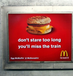
Take this advertisement for example:
mcdonalds_ad-Don't Stare Too Long

I found this picture online when I searched ‘McDonald’s advertisements’ on Google. Obviously, it is a picture of an advertisement, but we’ll pretend for the moment that we’re seeing it in person.

Imagine there were no text on the advertisement, and just a picture of an Egg McMuffin. Sure, many people would still see it as an advertisement, but it would also lose a lot of potential viewers in the noise surrounding it. These days, don’t pictures of fast food remind us of things like hear disease, obesity epidemics, animal cruelty, and minimum wage concerns as much as they remind us about the food itself? The Egg McMuffin is not innocent, and McDonald’s knows this.

The anchor text of the image reads, “don’t stare too long[,] you’ll miss the train”. Here, McDonald’s is distracting us from the rest of this contextual noise and making us see it as they want to see it: desirable. But I don’t think McDonald’s expects anyone to actually think, Aw man, I almost missed my train because I was so lost in the beauty of this Egg McMuffin! Good call, McDonalds. More likely, McDonald’s wants us to pick up on their intertextual play with sexual phrases. The “don’t stare too long” is just a textual equivalent of the quintessential American scene wherein the gawking male momentarily loses his wits while checking out a woman. Or, in linguistic form, something along the lines of this:

My eyes are up here

The McMuffin advertisement gets even more interesting once you look at its placement within the frame. We might expect the text to be somewhere on the bottom, in some more marginal position while the image engulfs most of the space. However, the anchor of this advertisement consumes half of the picture, given an equal prominence to the McMuffin itself. Whereas most advertisements idealize their products at the center of the picture, McDonald’s does not. It’s almost as if McDonald’s, through their suggestive language, is acknowledging that it is unhealthy—something less like food and more like a casual encounter with a stranger. And by making the text as prominent as the image, the reader is gestured to consider the guilty proposal as much as we are the product.

After all of this, I’ve come to see anchors as not only holding down a meaning for the picture, but also as attempts by certain parties to anchor the reader/viewer, to try and sway us away from the more prevalent—and perhaps more important—meanings behind objects. We, as consumers and citizens, need to remain critical and skeptical, so as not to fall under the spell of such textual hypnotics.
Idealizing the Hero

We’re in the middle of a superhero movie craze.  It started with remakes of superhero movies like the Dark Knight in 2008 and is continuing with the upcoming movies like Captain America: Winter Soldier and The Amazing Spider-Man 2 this year, and even The Avengers 2 in 2015.

Don’t get me wrong, I love the movies and the ambition behind them.  But I’m getting tired of the advertising: these repetitive movie posters.  Taking a closer inspection the movie posters are functioning in a pretty obvious way.

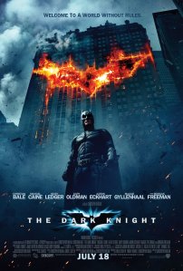
Sean Hall, in his book This Means This. This Means That outlines the many ways that viewers judge an image.  As he explains, “the forms of placement tell us what is most important to the producer in terms of communication” (89).  So what do the producers of movie posters want us to know about the movie, about the superhero?  If you think about audience perspective, the viewer can only see the movie poster from one angle: directly from the front.  They can control exactly what we see.

Let’s look at some of the features of posters.

First, nearly every poster places the superhero in the dead center of the poster.  The center is the most important place, “the thing that is seen to prevail over that which surrounds it” compared to the marginal objects (98).  In this case, the marginal objects are the rest of the city, like the buildings that surround Batman as makes a leap in his Batpod.  In the case of the Iron Man posters, it’s a handful of enemies and supporting characters that float somewhere around his shoulders in the background.  All of this points to the superheroes importance – basically, that the superhero of the movie is going to be the main character and the one the viewer identifies with, along with numerous other reasons.

??

Photo credit: Splatter.com

Photo credit: sci-fimovieposters.co.uk

Similarly, the hero is closest to the viewer out of the other images.  No matter what is shown in the background, the superhero makes up the definitive foreground.  This has the same effect of being in the center because everything is geared around the hero.

Third, the hero is “larger than life” – that is, depicted much larger than other people and his surroundings.  When the superhero is looking down, the viewer is essentially looking up to the hero.  The superhero gains more power from this position, since being higher is generally a place of superiority.  He becomes a role model.  The hero’s skills, his aspirations, and his very identity become something to look up to, no matter what the personal morality of the viewer is.

An interesting note is that the most idealized object is placed at the top of the image.  It isn’t too much of a stretch to compare these images of superheroes to gods.  God is always at the top of his images, at the front and center of whatever else is marginalized.  The superheroes are effectively the gods of their small worlds.  Pretty true.  Batman holds the city together by himself without the credit.  Captain America single-handedly brings down one of the most powerful men in World War II (according to the movie, anyway).


All in all, it’s a good setup that sucks the viewer into the world of the superhero, setting him or her up to believe in the hero’s power.  It’s predetermined after the viewer sees the poster that the hero will not fail, or will come out triumphant no matter the cost.  The posters that show the hero involved in some kind of heroic action while also the focus of the poster only emphasize their heroic nature.

All we need now is a new way to advertise movies, so we don’t need the same thing every time.

Source:

Hall, Sean.  “Visual Structures.”  This Means This.  This Means That: A User’s Guide to Semiotics.  London: Laurence King, 2007.  89-108.  Print.