iconography

Food Icons of the Unreal

The more I dig into the semiotic moves made by food companies on their labels and logos, the more I see that it is just as often a lifestyle or value being sold as it is the product itself. And, interestingly, there seem to be many obvious conventions to signifying these values. Industry by industry, artists and advertisers indirectly cooperate to solidify concrete iconographic codes. And these icons, whether we realize it or not, are very impacting.

In Understanding Comics: The Invisible Art, Scott McCloud uses the word “icon” as “any image used to represent a person, place, thing or idea.” Icons vary between realistic to entirely abstract—some representing the appearance of the thing itself while others bare no resemblance. Now, observe these logos not for their text, but for the icons behind them.

Green Giant Mann's Lehigh ValleyPell's Citrus and Nursery

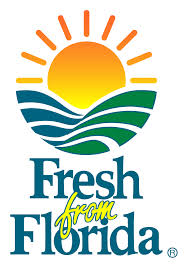
These icons begin more realistic representations of pastures with the Green Giant brand and become more abstract, ending with the “Fresh from Florida” appeal by Pell’s Citrus, which depicts the same idea in highly simplified use of color and lines.

Despite their different placements on the real/abstract spectrum, these icons are answering to the same code: the appeal to fantasies of agricultural purity. Americans love identifying the food that they eat with some ambiguously old-fashioned and unadulterated farm they have collectively imagined. The rolling, green pastures remind us of a sort of harmony between nature and our eating habits. Furthermore, the sun setting (or rising) behind these fields brings in its own culturally-embedded meaning: timelessness, predictability/stability, etc.

It makes sense that this icon—and the many similar ones across other sections of our food industry—would want to comfort us. Especially at a time when our methods of food production, distribution, and consumption raise serious concerns. As agricultural companies like Monsanto and oligopic competitors like Tyson and Perdue come under public questioning, food industrialists use these icons to lull consumers. The icons then become a sort of opiate to the masses, pushing the belief in a non-existent methods of production.
Stonecutter Homer

Why is Homer Simpson Yellow (And Why It Doesn’t Matter, Kinda)?

“Narf!”

“OK I love you buh-bye!”

“Hellooooooo, Nurse!”

You might recognize these catchphrases from the ’90s cartoon series The Animaniacs, a show about the three Warner siblings who were so zany that they had to be imprisoned in a water tower to ensure they couldn’t annoy anyone. Modeled after the Warner Brothers classic Looney Tunes, Yakko, Wakko and Dot were a trio of animals known for smooching everyone from Michaelangelo to Albert Einstein and breaking out into song on a whim. When you look at their jet black fur, clownish white faces and maraschino red noses, one can’t help but wonder: what the heck are they supposed to be, anyway?

The Animaniacs logo (wikipedia)

Recognizing the ambiguity in their own character design, the writers had a little fun with leaving us guessing. In an early episode, the Warner Brothers are in a session with their psychiatrist Dr. Scratchansniff when he poses the question to them. The brothers then segue into “What Are We?”, postulating all the potential animals types that might fit their description.

Ultimately, we realize the question is erroneous, and, in trying to deduce their identity, the joke is on us (“what we are, dear doctor … is cute”). According to Sean Hall’s “This Means This, This Means That,” “Adults often have to have things explained to them … because while the meaning of the drawing is often transparent to the child it is frequently opaque to the adult (68).” The visual interpretation of the protagonists is a gag itself.

Perhaps the most popular cartoon ever made, The Simpsons rose also rose to prominence in the ’90s, setting the precedent for primetime animated sitcoms. My mom let me watch it until she learned that Bart says “sucks” a lot, but I still managed to catch episodes when she was busy preparing dinner. Before she cut me off, she would always ask me, “Why are they yellow?”

After all these years, I’m pleased to finally have an answer to this question myself. In “Understanding Comics,” Scott McCloud describes a phenomenon called amplification through simplification. “When we abstract an image through cartooning, we’re not so much eliminating details as we are focusing on specific details (30).” Let’s use the lead character, Homer, as an example.

Homer Simpson of Sector 7G (boston.com)

Once the viewer acclimates to his skin tone, she will soon realize that Homer’s design is intentionally unremarkable; he is meant to represent the average middle-aged white collar middle class (as evidenced by his white-collared shirt). He has a squiggly line around his crown and only two remaining arches of hair on top of his head, representing his baldness (and therefore his age). His scruffy face isn’t animated with bristling hairs swaying with each turn of the head, but rather a flat, light brown circle painted around his mouth, suggesting lazes-faire attitude. Finally, his belly bump shows us he is a couch potato who worked hard to earn his beer gut. And, really, do we need to know anything more?

The modern cartoons of my youth have since been succeeded by the postmodern, perhaps most notable of all Adventure Time. A buddy cop-style series featuring the adventures of Jake the Dog and Finn the Human across the land of Ooo, Adventure Time scales higher up (toward the abstract) on McCloud’s picture plane than either the largely iconic Animaniacs or the Simpsons. Though many of the characters, including Jake and Princess Bubblegum, are very much on the iconic end of the spectrum, they often break from their default configurations into the realistic spectrum, creating a level of irony that the show has become so well known for. For example, you may have seen this clip of Finn trying to overcome his fear of the ocean:

Or, maybe the finely detailed contours of Ricardio’s face creep you out just as much as they do to me, signifying his nefarious nature.

Ricardio, heart of the Ice King (deviantart)

I used to think the fairly simplistic, iconic characters of my youth were drawn so as a way to cut the costs of animation, but, clearly, there is intentionality behind every tongue-wiggling scream.

Why you little!