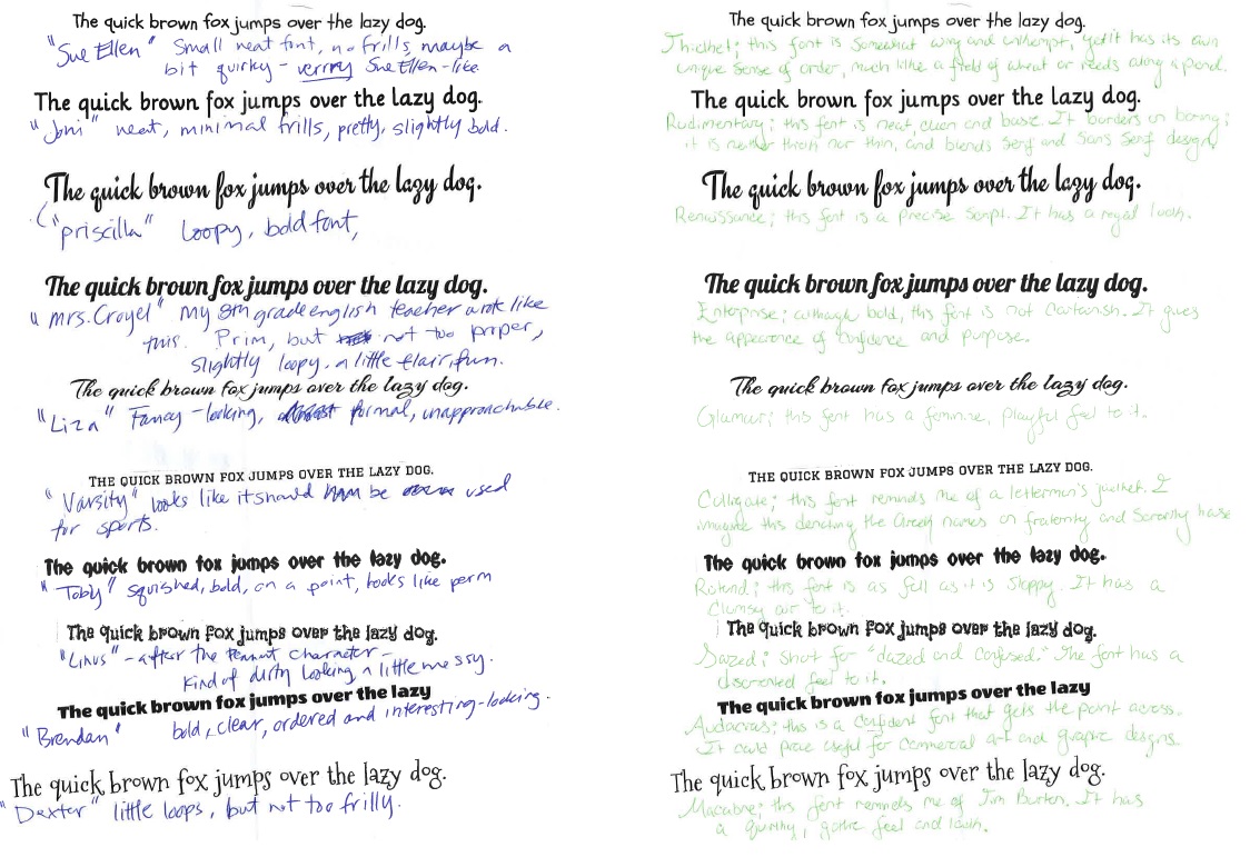
Since first starting working and creating posters I have become and addict to fonts and using them to communicate feelings and emotions. I often find myself looking and brands and logo and trying to decipher the hidden semiotics or meaning within the fonts. I decided to do my own little experiment. By having two coworkers who…
A. Use the computer daily
B. are female
C. are within the same age range
D. are intelligent
E. are my friends (Only a few people would like to take time away from their breaks for me)
I wanted to see how they viewed font compared to each other and compared to myself and the creator of the fonts. I should apologize now for the green ink, I don’t know what Person B was thinking.
Here are the real names of the fonts. All fonts were from Google and yes, they are all free!
1. Schoolbell
2. Lilly
3. Engagement
4. Lobster
5. Arizonia
6. Graduate
7. Punch Drunk
8. Flavors
9. Wendy one
10. Mountains of Christmas
What I loved about each person descriptions was how unified each person’s was. Person A used all NAMES while Person B used all ADJECTIVES. I happen to directly know some of Person A’s people of which she named the fonts after ‘Dexter’ or Mountains of Christmas is her sneaky beagle and ‘Brendan’ or Wendy One the ECON professor. She also used pop-culture references from Charlie Brown. I was amazed by her characters of each font and how for her, it directly related to a person in her life. Person B on the the other hand used terms and definitions almost for her font names and descriptions. She also happens to work in PR & Marketing at the College while the other is an Administrative Assistant. For both of their names for ‘Graduate’ they were spot on. Person A deemed it Varsity and Person B deemed it Collegiate.
I really want to show each person what the other said about the font so that they can see if each others relates at all. Is Person A’s people match the descriptions Person B gave?
It is amazing to see semiotics at use and the amount of detail and emotion a font can convey to different people. It is all perspective, and we all have a different one to use in learning.
Who knew how difficult this assignment would be. I have never constructed a photo essay before or taken groups of photos for a common cause.
Here I attempt to exposed my town’s negligence of tag clean up and the motive of a tagger through my own eyes and perspective. First noticing the crosses about 4 years I have since spotted them in other public areas and decided to explore the tagging more thoroughly. Why did someone tag crosses and ‘Jesus’? Why had they not been removed? By exploring the tags throughout my town I exposed not only the taggers possible motive but also a negligence of my town.
I thought of what Dr. Wolff said, “do not snap hundreds of images pick your shots wisely.” On a personal note, my phone has very limited space, leaving room for only 80 or so photos. My DSLR has room for thousands. As I normally shoot that way I wanted to try the challenge and I did for The Great Commission.
I figured I’d try something a little different with this assignment, so I posted a video of me talking about Persepolis for 11 minutes. Enjoy my beautiful face and silky smooth voice as I explain to you some of the brilliance behind Marjane Satrapi’s memoir. Enjoy!
According to Kirby Ferguson’s Everything is a Remix, 74 of the 100 top grossing films from 2002-2012 are either sequels, remakes or adaptations. “Perhaps audiences just prefer the familiar (Ferguson part 2).”
As Ferguson showed us, many Disney cartoons are based off Grimm fairy tales and various other sources, but traditional Saturday morning cartoons also caught on to the reiteration of successful shows to keep their audiences coming back for more. Preston Blair, cartoonist for Disney and Hanna-Barbera, showed how to draw character archetypes in many of his how-to books on, most notably Cartoon Animation.
If we examine the some of the characters in the Hanna-Barbera universe, we can see that many characters across shows share many of the same traits, often to convey something about their personalities. In 1969, Hanna-Barbera introduced the world to the crime-solving great dane Scoobert-Doo and the Mystery Machine gang of Fred, the All-American hunk; Daphne, the red-headed vixen; Velma, the bookworm, and Shaggy, the scruffy slacker.
After the success of Scooby-Doo! Where Are You?” Hanna-Barbera premiered a new cartoon in 1977 called Jabberjaw. Notice any similarities?
Many of you may also remember the Hanna-Barbera classic Yogi Bear and his little sidekick Boo-Boo, two pic-a-nic basket thieves who find themselves getting in trouble with Ranger Smith, the park ranger of Jellystone park.
That was in 1961. In ’62, audiences were treated to Wally Gator, an alligator who lives within the confines of the zoo and must be kept in check by zookeeper Mr. Twiddle. Are you noticing a pattern?
While these are examples of in-house copycats, there are plenty of instances through time of animation studios swiping character types from established shows. In 1990, John K. introduces us to Ren and Stimpy, a volatile chihuahua and stupid cat duo, the two always prying at each other’s nerves.
In 1993 with the launch of the Animaniacs, we get Pinky and the Brain, a pair of lab mice, the former a genius, the latter insane.
And then, a few years later, we get CatDog, a … yeah.
Just by looking at these images, without even watching an episode, we can deduce which characters in these pairs are the goofy half of the equation. The off-kilter eyes, hanging tongues and the buck teeth convey the stereotypical dopey look we’ve seen time and again.
With the popularity of Teenage Mutant Ninja Turtles, animators try to jump on the bandwagon of anthropomorphic fighting animals. Case in point: Street Sharks and Samurai Pizza Cats.
With the overnight success of Pokemon, we got arena-battling anime like Digimon
And then we get to the other half of the equation with the reimaginings. The 1960s The Adventures of Johnny Quest got a ’90s iteration in The Real Adventures of Johnny Quest. Tiny Toons was a spiritual successor to the 1940s Looney Tunes. Muppet Babies were exactly that to the original Muppets. The Rugrats became teenagers in Rugrats: All Grown Up. A Pup Named Scooby-Doo took us back in time with the gang before they were old enough to drive the Mystery Machine. James Bond Jr. And adaptations. Garfield and Friends brought the tabby cat to the small screen after finding success in the funny papers. Street Fighter and X-Men both got their own cartoons in the ’90s. There are so many it would actually take forever to list them all. So, I think this provides a good-enough picture of the highly iterative nature of cartoons.
And, finally, truth-bomb: SpongeBob SquarePants is just Rocko’s Modern Life underwater.
I grew up where the ocean meets the Pine Barrens, and if there is one thing to take from growing up in this place is that nature has more power than people often realize. From hurricanes to tree roots slipping through cracks in the foundation of a house, it can be a very volatile place to live.
Often when we think of ghost towns, we think of full towns still standing, left abandoned over time. But it’s hard to have ghost towns here, where the trees grow thick and the weather can be hard. While Centralia, PA still stands in it’s full glory, places in New Jersey like Ong’s Hat, Fries Mill, or Hampton Furnace rarely get to stand, untouched for very long. Which is why I choose to photograph the remains of towns left behind, surrounded by woods, and un-preserved.
My original intention was to photograph a series of places, but poor weather did not permit the far hikes that were required visit many sights. Instead, I focused on one: Weymouth Furnace. Once a forge, than a collection of paper mills, it was permanently abandoned the late 1800s or early 1900s, left in a section of woods that would wreak havoc on the foundations, walls, and roofs of the buildings. While the deterioration process was helped along by a breaking dam early-on, more of Weymouth Furnace remains than most other abandoned town cites in New Jersey. What stands is predominantly foundation, with a few selection portions of walls. The land has since been purchased by the state and turned into a park, but even with attempts as preservation it’s clear the forest is wild and strong, with weeds, flowers, and trees growing strong in the wake of the former industrial cite.
It’s hard to believe the medium of cartoon animation is only roughly 100 years old, given how ubiquitous characters like Mickey Mouse, Scooby Doo and Spongebob Squarepants have become. We have backpacks emblazoned with Dora the Explorer’s face, vitamins made with Wilma Flintstones visage and even entire theme parks inspired by classic animated features. Baby boomers, Generation X and millennials all have cartoons from their youth that they remember fondly, and I posit that the tried-and-true intro/theme song combination that begins every episode plays a heavy role in reinforcing our connection to those viewing experiences.
While I could analyze the excellent intro sequence to Batman: The Animated Series, sadly, it’s already been done (and I highly suggest you click that link), so I’ll move on. One of the most successful cartoons in history, the Looney Tunes still appear in various incarnations even to this day. Predating the first commercially viable TV sets, the Looney Tunes animated shorts debuted in 1930 in theaters on film reels. Because animated features were still relatively new during the World War II era, producers modeled these shorts after existing entertainment structures, most notably Vaudeville and orchestra. Now heralded as one of the most influential cartoons of all time, many Looney Tunes shorts begin with the recognizable (blank) song in much the same way an orchestra would play an opening song before the curtains rose in a play.
In the first second of the intro bumper, we can see the Warner Bros. logo come into focus on the screen as if we were seated in a theater and the lights slowly adjusted in brightness to spotlight the beginning of a performance. Once the WB logo fades off, we then get a close-up of Bugs Bunny, the star and ringleader of the Looney Tunes. What’s important here, which differs from many cartoons intros of today, is that by showing us a large disembodied bucktoothed Bugs Bunny on screen, we’re being told that we’re not in attendance to watch a story necessarily, but rather a character. Then, as if the red rings around his head didn’t already resemble curtains, we see Bugs lift the projection screen right before our eyes, revealing that we’re very much about to watch a tongue-in-cheek, self-aware farce featuring anthropomorphic animals. Bugs lounges on top of his own name, reading “BUGS BUNNY in,” reinforcing that the character is about to get himself into some bizarre antics.
As TV sets became affordable and began to fill homes all across America, studios like Hanna-Barbera ushered in a new era of cartoons as the golden age of animation entered its twilight. With classics like the Jetsons, Scooby-Doo, Where are you? and The Flintstones, the studio gave us countless cartoons classics that became pieces of TV history. Once the most successful, longest-running animated TV series in history (an accomplishment since taken by The Simpsons), The Flintstones popularized many paradigms animated shows still follow today, perhaps most of all the use of a theme song with catchy, unforgettable lyrics.
Before the lyrics begin, we see main character Fred operating his dino-crane for just a split second. The camera then pans to his supervisor as he glances at his watch, waiting to sound the klaxon for ending the work day. But how do we know in these first three seconds that Fred is a construction worker? For one, we see his boss wears a hard hat, but, perhaps more importantly, he is standing next to his office, which has conveniently been labeled “office” on the outside wall. One simple word provides all the context we need for the first few shots of the intro.
And the very first lyric of the show’s theme song is “Flintstones,” a no-nonsense primer to prepare the audience to join the family for their newest episode. After we “meet the Flintstones,” the next line in the song fills us in on the entire pull of the show: “They’re the (not a) modern stone-age family.” This is it; this family is the seminal satire of modern America through the frame of the stone-age. The song culminates in Fred’s catch phrase “We’ll have a yabba dabba doo time/a dabba doo time/we’ll have a gay old time,” injecting a catchphrase that once meant nothing and bringing it to the forefront of pop culture references.
Flash-forward to the ’90s, when dedicated childrens’ entertainment stations like Nickelodeon and Cartoon Network found their stride. Branded as Nicktoons, Nickelodeon’s original programming defined a generation of kids, providing millennials with a group of friends to grow up alongside of in the Rugrats.
The intro theme begins with a drumroll as an airborne diaper falls into place on main character Tommy Pickles’s bare baby bottom. As he regains his balance after this handstand maneuver, the animators pull a clever little trick by panning the camera to Tommy’s 1-year-old perspective, making his living room seem 10 times bigger than it would appear to our adult perspective. We go on a journey with him for just a few baby steps toward his bottle, steps that would seem insignificant to us but are larboriously coordinated by little Tommy. Just before reaching his milk, he takes a tumble to the floor, and we take that sudden plummet with him. We not only see the world from his perspective, we also feel it. As he attempts to touch his lips to the lid of his bottle that is just outside his reach, he is approached by one of his father’s toys (Stu is an inventor), and the camera pans out, revealing that, to Tommy, his living room is actually so large that it rolls over into the horizon because he is so small he can’t see the whole thing from his prone position on the floor.
Perhaps the best part of the whole intro is the very end, when the camera reverses from the baby perspective to that of the adult characters (in this instance, Tommy’s parents Stu and Didi). Didi lifts her son from the floor and sees the whole gang, her son nearest her in her arms, with her niece Angelica beside him, and his three best friends, Chuckie, Phil and Lil in the background. The children only speak to each other when the parents are out of the room, and they take those opportunities to go on adventures. but, when adults are present, they revert to behaving like unsuspecting, harmless babies. To encapsulate this conflict, we see Tommy freeze for a bit on screen, as if he’s mulling over in his head whether he wants to do it or not, and then, after a few seconds, decides to squeeze his milk bottle all over his parents and the camera (us, the viewers), demonstrating how unpredictable his childish behavior really is.
If SpongeBob SquarePants were an actual person, he’d be in high school at this point.
Airing in 1999, SpongeBob SquarePants has become not only one of the longest running animated cartoons in TV history, but he has also established himself as a cultural phenomenon. Children and adults alike know he lives in a pineapple under the sea, having become the darling of both the twilight of ’90s Nickelodeon cartoon fans and kids born in the 21st century. In short, SpongeBob has been around for a while.
In the 15 years SpongeBob has been on the air, we’ve since seen a dramatic change in computer technology. Youtube wasn’t even around when SpongeBob first aired, but now his escapades span the video service in more ways than one. Since the advent of the online video remix, SpongeBob and his friends have served as fuel for countless comical remixes of popular songs, mostly derived from a selection of the show’s most memorable scenes.
The season 2 episode Band Geeks, which aired September 7, 2001, introduces us to one of the show’s earliest musical performances. In Band Geeks, SpongeBob’s neighbor, Squidward Tentacles, reignites his clarinet-dueling rivalry with his arch nemesis, Squilliam Fancyson. To prove to Squilliam that he possesses more musical prowess, Squidward bets (on a bluff) that he can conduct a knockout musical ensemble to open the Bubble Bowl, the underwater equivalent of the Super Bowl. The only problem is: Squidward doesn’t actually have any musical talent, let alone a band to conduct for the opening ceremony. He enlists in the denizens of Bikini Bottom to take up instruments and practice for the big show, but, predictably, their quirky personalities thwart his efforts.
It’s now the night of the Bubble Bowl, and Squidward’s band still hasn’t practiced a single note. But, rather than play horrendously on brass and wind instruments, SpongeBob and the gang surprise him with rockin’ percussion and electric guitars, performing Van Halen’s Sweet Victory in a haze of fog machines and neon lights.
One of Squidward’s few shining moments, the scene has since become one of the show’s most memorable. So much so, that fans have taken the source video and remixed Squidward’s band to pantomime playing many songs (mostly nu metal) that were popular in the early aughts. For example:
The shot begins with again with Squidward nervously expecting a complete debacle, an embarrassment that will haunt him for the rest of his life. Instead, Linkin Park’s hit single “Numb” begins, with villain Plankton playing the opening ditty on synth, followed up by Patrick’s drum playing when the heavy riff and percussion come in. The creator then splices in scenes from outside of the Band Geeks episode to more accurately mirror the song playing: we see speakers thumping and SpongeBob scratching a record. The characters’ expressions perfectly reflect the quiet verse/loud chorus nature of Linkin Park’s music: Plankton is expressionless as he strikes each key, and SpongeBob has a blank gaze on his face while singing the opening lyrics. But once Chester Bennington begins injecting more emotion just before and during the chorus, SpongeBob begins using his arms as part of his performace, pointing at the crowd in a sweeping motion during the lyric “But under the pressure of walking in your shoes.”
This remix works so well because, as Chuck Tryon writes in “Pop Politics: Online Parody Videos, Intertextuality and Political Participation:”
“Most parodies reiterate elements of the original video if only to create a point of departure from the original, but the primary techniques are inversion, in which the video maker inverts the meaning of the original by adding new elements, and exaggeration … (Tryon 210).” One could argue exaggeration is a central tenant of both cartoons and nu metal, so the two fuse here so naturally, it’s hard not to laugh. The chorus, in particular, when the amps come in and the guitars explode, syncs with the stage lights and fog machines splaying over the stage, as SpongeBob delivers emotional vocals with his eyes closed. Sandy shreds on her guitar in the background while SpongeBob laments how Numb the recipient of the song has made him feel. At the bridge, in particular, beginning at 2:10, the song and the visuals combine in a way that summarizes the conceit of the entire episode.
And I know
I may end up failing too
But I know
You were just like me
With someone disappointed in you
Squidward, after recovering from the aftershock, finally gets invested in the song. Squilliam is so crushed from seeing his rival outperform him, he faints from the awesomeness unfolding before him. He is carried away on a stretcher as Squidward’s grinning face enters the frame, waving goodbye to the pressures of trying to live up to another’s expectations, the theme of “Numb.”
In another (NSFW lyrics) example, we have another seminal nu metal song, Disturbed’s “Down With the Sickness,” played over the same scene.
Again, the editing is so tight, with Patrick’s drum playing looping over to match the cadence of the song. Ms. Puff and Sandy back him up on guitar, the anger in their faces leaving you anticipating the big drop. The editor takes some more liberties with the source materials though, distorting certain images (like the live action shots of the crowd, which do appear in the original, and the shots of the guitar and keytar before the first verse) and also adds in fade-to-black transitions before and after SpongeBob utters the first few growls in the intro (0:50), adding to the dramatic tension.
New to this interpretation of the scene, the editor departs from the Bubble Bowl scene to one of SpongeBob serenading the surly Squidward with a ukelele in the second verse. From the first verse, the language shifts from the lead singer describing his own struggle with “the sickness” to the second person. As SpongeBob sings to Squidward (at 2:02):
I can see inside you, the sickness is rising Don’t try to deny what you feel
and
It seems you’re having some trouble In dealing with these changes Living with these changes (oh no)
SpongeBob has gone from his empassioned performance onstage to the lowkey acoustics of a ukelele, with a sly smile on his face, as if he has already accepted “the sickness” and is now trying to coerce Squidward into doing the same. Finally, at the breakdown (3:07), the lyrics take a VERY dark turn, the lead singer yelling at his abusive mother for a full minute, swearing at her and wishing she were dead. When SpongeBob is finished with his tirade, Squidward’s surprised face comes on as the music turns quiet once again, as if to give both him and the audience a moment to absorb and recover from what we just heard the kid-friendly yellow sponge say. By extending and rearranging a few shots here and there, the meaning of the original scene inverts from one of celebration to one of lamentation and anguish.
But I can’t leave SpongeBob hanging on such a dark note. Here you go, buddy. Have some more upbeats remixes.
This is a Facebook group that aims to unite, share, and educate Saudi students in America. Two of my Facebook friends actually shared the post and it showed up on my timeline. I cannot say that I spent too much time on their page but the photograph caught my attention.
“The first image refers to pedophilia in the Vatican.
Second child sexual abuse in tourism in Thailand, and the…
third refers to the war in Syria.
The fourth image refers to the trafficking of organs on the black market, where most of the victims are children from poor countries;
fifth refers to weapons free in the U.S.
And finally, the sixth image refers to obesity, blaming the big fast food companies.”
Photographed by Erik Ravelo a Cuban photographer and artist he looks at children in their world. Sometimes children are neglected, in the form of rights and Ravelo called attention to this. Reminds me a bit of Trachtenberg. The photo, titled the “The untouchables”, puts children on crosses of their oppressors. Each photo presents a clear, disturbing message. Placing them all together shows the injustice is spread worldwide. We hear about each individual story in the news or on social media but they are normally not brought together. It unifies. It shines a light. It promotes change.
Additionally the viewers or audience did not need to know the details about each countries specific issue to identify it. I was unsure about Thailand and the organ black market photos. However I was immediately about to understand using children for amusement, specifically with the bright floral shirt, cap, and I believe camera in hand of the male cross. These items signified tourist, amusement, something that I have often thought about when friends travel to island destinations. The shift children on the cross in scrubs made me think of surgery or unethical treatment. I was reminded of my mash up where clips of a doctors wearing those green-blue scrubs injected a beagle or danged a rat exemplified harsh and cruel treatment of animals to relate it to human testing.
These children may not have loud voices, or physical strength or knowledge to change or release themselves from their oppression. Without the photographers motive and interpretation all the issues would not have been brought together.
The idea of fun has changed so much since I was younger. As an adult “fun” has to happen within “acceptable guidelines” and “age restrictions.” When I was a child I loved to swing on our swing set for hours—I didn’t need to listen to music or play video games while I did it, the swinging was enough. In middle school I started to use more
technology and in high school I was totally addicted. I also read a lot.
I used portraits and collages to show adults doing “childish” things but also to show that what we did as children is still with us as an adult. I also wanted to challenge the ideas that adults have
different activities to call fun. Adulthood
shouldn’t be subdued; people should feel free to be open about their interests and do what makes them happy without being judged.
While shooting these photos, I went to a
playground. Many people stared at us while my friends played on the swings in their professional wear and I took pictures.
I believe the work shows the change and the
influence of our hobbies over time. Everyone is
doing something they love to do in every photo.
Annette Khun says that a photograph is a “prompt, a pre-text, [and] sets the scene for
recollection.” My photo essay revolves around recollection. I asked my friends what they did for “fun” at ages 5, 10, 13, 15, 18, and 21. I chose those ages because I believe they mark specific ages at which rights of passage begin.
At age 5, most children are beginning to go to school, at age 10 they are leaving elementary school and at age 13 they are leaving middle school. At 15, people are well into high school and on the road to self discovery, which has usually changed or finished by age 18 when they graduate from high school and become “adults.” Then age 21 happens and some people go to bars while others accept responsibilities and begin to see that certain “fun” things aren’t acceptable any more.
I chose to explore this topic because I am so open about the hobbies and activities I do which make me happy, even though many people say that I am childish because of it.
The only pictures which depict reality in my photo essay are the portraits. The portraits show an attitude relating to the subjects given profession. The first group of photos is of Audrey, the creative director for Kyo Daiko, a taiko group in Philadelphia, PA. She is holding her bachi (the sticks used for beating the taiko drums) in front of her with a stern face. That is how she performs. That is how she shows that she is disciplined in that art.
In my own portrait I am sitting on the floor with a notebook and pen in my hand and forced smile on my face. I want to be a writer and so I am writing in my portrait.
Errol Morris that in the act of choosing to take one photo or the moment you “select one
photograph from a group of photographs” you are very close to “manipulating reality.” I did nothing but manipulate reality in this photographs.
Every photograph has been posed or coached in some way. I took at least 50 photos of each
subject and then chose which one looked the best or could be manipulated easily. In one picture I erased part of the back ground so that a security pad was not behind my head. I cropped many photos but still left some active space, space between the subject and the frame, in the photographs.
Sontag stated that photographs “may” distort, that there is “always a presumption that something exists, or did exist, which is ‘like’ what’s in the
pictures.” What is in the photographs is as important as what is left out of them.
The picture of Audrey swinging the Lousville Slugger
T-ball bat is one of the strongest in this collection.
In the photo where Audrey relives her years playing
softball for the Glendora Girls Athletic League, there is depth of field, leading lines, and active space. Audrey is in focus while the front yard of my grandmother’s house is not. It forces the viewers eyes to Audrey and the action of swinging the bat because the background is not busy, there is less noise to interfere with the message.
The leading lines form from the bottom left corner with her leg, loop around her arms and upper body, and follow out to the tip of the bat. It forces the viewer to look at the full gesture of swinging the bat.
I tried to use minimal active space. I did not want to crop out the subject and used the crop to focus in on the subject.
Each collection ends with a collage. The collage shows all of the childish activities in black and white and in the
background. It represents the idea that although our past is behind us, it is still with us. My intent with the collage is to bring
attention to the interconnectivity of our individual lives. Life is not like a language that leaves you from prolonged non-use; it is more like a pyramid which gets taller and greater by building on past experiences.
The black and white photographs represent the past and the things we no longer think about. The
colored portrait is the
present and the identity.
I chose to use a Nikon D3100 DSLR
Camera for the quality of the image. I knew that I wanted to crop, edit, and play with all of the
photos in order for them to meet my needs.
Although many point and shoot camera have come a long way in the quality of images they do not offer me the same control as a DSLR.
I used Photoshop to edit all of the images. I cropped, erased pictures and items from walls, and even increased the depth of field. I did this to make the images more interesting.
Using the high quality camera and photo-editing software gave me a lot of control. The only noise in the images is noise which I created. I feel that this made plenty of room for my
intention to be shown through the images.
This is easily the photo I’m most proud of out of the entire essay because it works so well on so many different levels. For this particular photo, I turned the motion blur off since my photos were already being filtered through the window’s rain-encrustedness.
There lies a certain level of symmetry in the photo between the sky and the water; if the image were flipped, they could both pass for one another, given their cloudiness. The depth of field effect also lends to its eye-catching nature. The crescent-shaped waterfront begins in the bottom left at the docks and a boat in view with three talls buildings not too far off for scale. And our eyes also naturally follow the “leading line” along where the water meets land/buildings and brings us to the five tall buildings aligned way in the background. And, lucky for me, the water wasn’t empty that day, and the two boats in the frame serve as balancing elements to the otherwise overbearing cityscape.
Interestingly, the waning landscape trailing off to the right edge of the photo serves so many purposes. Not only does it frame the water on this cloudy and rainy day, but it also frames the sky and the part of the city that is in view from everything else, bridging together and yet separating all these distinct elements. The diagonal lines overlaid on the left side (cityscape dynamism).
Above all else, I think, the photo comes together so nicely thanks to its adherence to the rule of thirds. If divided into the nine equal parts according to the rule, the divisions would appear over the prominent buildings on the vertical lefthand line, and the top horizontal line would cross the photo just where the skyline and the horizon meet. The righthand vertical line and the top horizontal line would intersect at the buildings in the background, and the bottom horizontal line would cut through the two boats on the water, lending a wonderful balance to everything. And, even if it was not by design (as I had no choice but to go over the bridge), the viewpoint also ties into the photo’s beauty. Taken from high above the Delaware River and far away to form the wrapping effect Philadelphia waterfront, I couldn’t have taken this shot (or at least gotten the same feeling from the same objects) from another perspective.